
UX Research: it may not be as glamorous as its UX writing and content design cousins, but it is a critical part of product design, no matter what your official role is.
But if you’ve ever found yourself digging through heaps of disorganized user research data and thought, “Wow, there must be a better way to do this,” there is — Airtable! As UX writers and content designers, our job is to present information in an organized, context-appropriate way. Airtable is a great way to visualize patterns in your findings and collaborate with a distributed UX team.
What is Airtable?
Airtable is an online tool that can replace any spreadsheet or list on your computer (while looking sleek and colorful the whole time). Here’s what makes it unique:
- It’s cloud based, making it excellent for collaboration between stakeholders
- It’s a database-spreadsheet hybrid, visualizing relationships between information
- It’s a low-code platform designed for simplicity and ease-of-use (no more remembering Excel functions!)
I love its user-friendly, intuitive design. The learning curve is minimal and once you start working in it, you’ll be thrilled by the endless potential to optimize your workflow.
So how can you use it? Businesses use it for project management, customer-relationship management (CRM), project planning, content calendars, tracking inventory, timesheets, org charts, and daily check-ins for remote teams. Check out their templates for more inspiration.
For everyday life, there are templates for wedding planning, restaurant field guides, apartment/job hunting, shopping lists, gift idea trackers, study guides, recipe organization, mailing lists, and more.
In the design world, use cases include product roadmaps, Agile workflows, card sorting, content audits, an Eisenhower matrix, or entire design systems. In this article, I’ll share how we used Airtable to organize UX research data.
Terminology
Before we continue, here’s a quick guide to common terminology you’ll find in Airtable:
Spreadsheet = Base
Each spreadsheet is organized into its own spreadsheet file. In Airtable, each spreadsheet will become its own base.
Tabs = Tables
Spreadsheets contain tabs for different data sets. In Airtable, each type of data is organized into its own table.
Row = Records
Spreadsheets contain rows of information. In Airtable, those are called records.
Columns = Fields
Spreadsheets contain columns of data. In Airtable, those are called fields, and there are dozens of field types to add formatting to your data.
Project overview
As the final phase in the UX Writing Academy’s certification course, I joined a small team of fellow students to rewrite screens for primary user journeys in the HiGrade mobile app.
HiGrade offers users instant cannabis testing via machine-vision technologies. People use it when they want to know the quality or potency of bud, or to consult with HiGrade’s expert agronomists about their grow operation.
Our goal was to identify where copy was technical or unclear, uncover user pain points that could be addressed through design thinking, and ultimately convert free users to paying subscribers. Here’s the case study I wrote on our work and results.
In order to understand the specific needs of HiGrade’s customers, we conducted three forms of user research: interviews, competitor analysis, and voice-of-customer feedback. Since there were multiple contributors, we needed a central location to collect our findings. Enter: Airtable.
Competitor analysis
To better understand where the HiGrade product sits in the market, we ran a competitor analysis of apps targeted to plant growers or cannabis users. Several goals guided this stage of research:
- Understanding user needs that are being addressed (or ignored) in the industry
- Determining how competitors approach design challenges
- Identifying ways to distinguish HiGrade’s value proposition from its competition
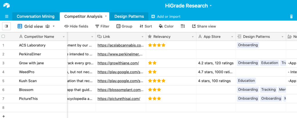
In the Airtable base, we created two tables for the analysis: one to list all major competitors and one to collect screenshots of flows that could be relevant to our redesign. If you use a similar format, here are fields to add to each table:
Company table
- Name of company (e.g. Blossom)
- Type of product (e.g. plant growing guide)
- Value proposition (e.g. “Blossom – the app that guides you through plant parenthood, supports, and inspires you to plant, grow and care with confidence.”)
- Relevancy (1 star = indirect competitors, 5 stars = direct competitors)
- App store rating (e.g. 4.7 stars, 1000 ratings)
- Cost (e.g. $19.99/year)
- Design patterns (connected to the “Design patterns” table we’re going to build)
- Link to website
- Notes
Design patterns
- Feature name (e.g. onboarding)
- Name of company (connected to the “Company” table)
- Screenshots
- Notes
Linking records helped us visualize which design patterns go with each product.
Voice of Customer data
To ensure that our designs are user-centric, we needed to gather information on customers like:
- What is the culture like? How do they talk about cannabis?
- What’s their attitude towards growing (or using) cannabis?
- What motivates them to grow/use?
- What do they care most about as growers/users?
- What app features would inspire appreciation & loyalty?
The best place to get this information is directly from customers. However, we didn’t have access to real users for interviews, so we arranged another option: voice of customer data. By searching for what users were saying about the app, similar products, or cannabis growing in general, we were better equipped to understand user needs and language.
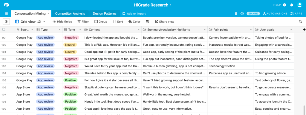
In Airtable, I set up a table with these fields:
- Source (e.g. App Store, Reddit, Facebook group)
- Type (e.g. app review, online group)
- Tone (positive, negative, or neutral)
- Content (copied and pasted into cell)
- Summary/vocabulary highlights (to understand language and tone of users)
- Pain points (to direct design decisions)
- User goals (so we know how to best support them)
💡 Tip: for records with lots of written information, be sure to set the row height to extra tall so you don’t have to expand the cell to see its contents.
Step by step guide/tutorial
So, ready to start your first Airtable base? It’s pretty simple:
- Make an account (it’s free for individuals and teams just getting started)
- Set up your base (from a template or from scratch)
- Write in your base guide (add context and outline goals)
- Share with collaborators
- Choose how to organize your data (“sort by” feature)
- Link records to show relationships between different tables
Have you used Airtable in your UX process? Comment below and tell me what you used it for!
Keep learning
UX research for beginners (article)
Who’s afraid of UX research? with Dr. Natalya Sarana (podcast episode)
Prototyping tools for UX writers and designers (article)
Top 10 no-code tools for designers (article)