

What is microcopy?
Microcopy is the small text snippets that guide us through websites, apps, and other digital experiences. It comes in many shapes and forms, but it has a common goal: To help people navigate through a digital product or service as smoothly as possible. We can think of microcopy as a way of using words to solve problems.
Creating microcopy is one of the main tasks (but not the only) of UX writers and content designers. If you’re new to the game, you may well think “do we really need to hire someone to write Click Here on buttons?” The answer is “you bet!” for several reasons.
- First of all, “click here” is not a good choice for a CTA, because it is not specific. This makes it unclear for everyone, including people with screen readers who often use the screen reader to read out link CTAs on a page. “Click here” means that they have no idea where the link leads.
- Secondly, choosing the most useful and therefore best-performing microcopy takes a lot of background research. To hit the nail on the head, we need to be fully aware of who the users are, where they are in the user journey, what they are trying to accomplish, and how we can adapt the brand voice for a consistent product experience.
- Finally, there’s a lot more to microcopy than CTA buttons. If you start digging through an interface, you’ll find pieces of microcopy lurking around all over the place.
Here’s a list of the main types of microcopy in digital interfaces:
- Onboarding copy – the text that guides users when they sign up for a new product or service
- Error messages, including the copy on 404 pages – short texts that inform the user of a problem, for example when an incorrect password has been entered. Here’s a whole article devoted to error messages.
- Success messages – the “yay, you’ve got this!” type of copy often shown when the user has completed a task.
- Tooltips – labels with text are shown when a user hovers over or touches an element on the page or screen. Tooltips give the user more info about functionality and features.
- Text fields in online forms – super important to make sure people don’t give up before completing a form.
- Empty states – sometimes, there is nothing to show on the screen because the user hasn’t started using a particular tool or service yet. This is a good opportunity to add some explanatory copy and/or image, or at least explain why the page is empty.
- Loading messages – copy shown while the user is waiting for a program to process an action, like “hold on tight! we’re getting your results – shouldn’t take more than a minute.”
- Captions – short texts below a picture that describe its content.
- Image alt texts – short texts that are read out by screen readers and also shown if the picture doesn’t load properly. Alt texts can be crucial for accessibility (with the exception of purely decorative pictures).
- Notifications – short messages with important information beyond the scope of regular user task flows. Notifications are often time-specific, for example when an upgrade is available.
- Offboarding copy – the text that is shown when a user decides it’s time to say adios to a product or service
One thing almost all types of microcopy have in common is that they drive user action. Onboarding copy guides you through unfamiliar tasks in an easy-to-follow way. A microcopy error message would prompt users to take action by fixing the problem.
Is microcopy the same as UI copy, UX copy, and microcontent?
It depends on who you ask. For sure there is a great deal of overlap between these terms. I think you can make the same distinction between UI copy and UX copy as you can between UI design and UX design. In other words, UI refers more to the visual aspects (the form) of an interface, and UX more to the practical aspects (function). (Of course you can argue that the form and function go together and need each other.)
Microcontent is, as far as I can see, a term used already in 1998 by Jakob Nielsen from NNGroup to describe elements like headings, subheadings, introductions/preview texts/meta texts, and email subject titles. Again, some overlap, but not quite the same.
Microcopy is not marketing copy
Before we move on, just a quick note about what microcopy is not. It’s tempting to include any short copy in the definition, especially if that copy is found in a digital product.
But in product design, we usually draw a line between marketing copy and microcopy. One reason is that they have fundamentally different goals. Marketing copy is primarily used before a product has been sold and tries to persuade people to cough up the cash. Most microcopy is used after a product has been sold and tries to make it as smooth and easy as possible to use.
Again, there is some overlap. Users may meet plenty of microcopy moments before or while making a purchase (requesting demos or other information through online forms, for example). And marketing doesn’t always stop after a purchase has been made (for example when the users can upgrade to another version).
Because of this overlap, it’s a great idea for marketers and UX writers to take an interest in, get inspired by, and learn from each other. OK personally I’m hoping that marketing will learn more from UX than the other way around, but that will be another blog article.
The early days of microcopy
Why have people been making such a fuss about microcopy in the last few years? Because for a long time, it was a neglected part of UX design. Cryptic error messages like this one used to be common:
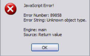
Unless you’re a developer, this information has zero value. The user has no idea what has gone wrong, or why, or how to fix it. If anything, it makes end-users confused, annoyed or worried.
The person often credited with coming up with the term microcopy for text in digital interfaces is Joshua Parker. He saw the power of these small phrases while working at User Interface Engineering. He noticed that many people got stuck on a check-out page because they entered the wrong address. So he added the explanatory microcopy “Be sure to enter the billing address associated with your credit card” and boom! Problem solved, revenue increased.
Joshua described his experience and introduced the term microcopy in a blog article already in 2009 (check it out!). This is around the time app development was about to explode. The AppStore had launched in July 2008. Google Play followed four years later. Microcopy is a crucial part of app experiences. When apps became mega-popular, the need for better microcopy grew and companies started to see the potential it had.
Why you should care about microcopy
A great way to illustrate the importance of microcopy is to simply remove it from a screen. Without any guiding text, the product is a confusing mess. The user wouldn’t have a clue what to do:

Image by 200 Degrees from Pixabay
You could say that microcopy is crucial for two main reasons:
1) It makes it easier for people to use a product or service. Clear microcopy helps users find and complete the tasks they have in mind. It can be used to reassure users and build trust, for example by explaining why you’re collecting their data. Muddy microcopy on the other hand creates friction or worse—unclear error messages can cause anything from irritation to fear and panic.
2) As it’s strongly related to the actions a user takes, it’s been shown over and over again to have a great effect on conversion rates. Choosing the right words, and showing them at the right moment in the user journey, can make the whole difference to whether somebody completes a purchase flow or signs up for that newsletter.
In short, microcopy is a great chance to influence the overall experience of a product. At the same time, it’s hardly some kind of miracle medicine. Microcopy is one part of product design and it needs to be aligned with the visuals, business and user goals, and the voice and tone.
Examples of good microcopy
Let’s look at a few examples of microcopy in action.
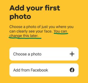
Anticipate user concerns
A great way to use microcopy is to anticipate user concerns, so that they don’t get stuck in a flow. Known as mental relaxers, here’s an example from the dating app Bumble. By confirming that the main photo can be changed later, new users don’t have to fret about finding the perfect picture before signing up:
There are numerous other examples of similar scenarios in today’s apps. You’re probably familiar with statements like “You can review your order before paying”, “You can always change this later,” “We only send relevant updates”, “We never share your data with third parties”, and “We hate spam as much as you do.” It’s a simple and effective way to give users the confidence to move to the next step (as long as the statement is true, of course).
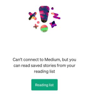
Even better is when an app anticipates questions I didn’t know I had. When I had network issues on a train, Medium informed me that I could still access all my saved articles. I wouldn’t even have thought about it unless they told me:
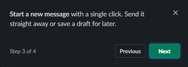
Be clear about the number of steps
Include a progress tracker to give users an indication of how long a form or other flow is. Here’s an example from Slack:
Indicate the time commitment
If you can, you can also be clear about how much time a particular flow will take. I happily joined Zest’s 8-second tour, for example:

Again, this kind of confirmation only has a positive effect if it’s true. If the tour had turned out to take 20 seconds, my trust for Zest would have gone down the drain.
Here’s an example that kills three birds with one microcopy stone: It tells me that it’s free, that it will only take two minutes, and that I won’t need to leave my credit card details. That’s all I need to know:

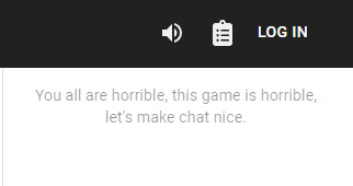
Using microcopy to strengthen your brand
Tapping into your brand voice can be an excellent way to create trust and connect to your users. To do this with microcopy, it helps to have a well-defined voice and tone that specifies how to adapt your copy depending on where the user is in their journey.
This piece of microcopy wouldn’t work anywhere except in the game Cards Against Humanity, for example, where it fits perfectly. (For those who don’t know, it’s a game where the most horrible person in the room wins):
Not-so-good examples of microcopy
What about some examples that miss out because they don’t follow best practice? Thoughtless microcopy runs the risk of confusing, annoying and even excluding people.
Confusing copy
An example of a typically unclear and annoying popup is YouTube’s ongoing attempt to make us sign up for the premium version:
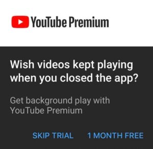
If I’m not interested in the premium version, I have to click on “Skip trial”. It’s confusing because the trial is not mentioned anywhere else in the popup. It feels like it’s intentionally trying to confuse me. Something like “Maybe later” would make more sense. Now, all I think when I see this popup is “screw you, YouTube”. Yep, that’s the response it evokes in me 🤷♀️
Confirmshaming
Confirmshaming is when products make you feel bad, stupid or silly for opting out of an offer. One of the most extreme cases I’ve seen is this one, spotted on HootSuite:

Perhaps the creators behind this popup think that they know the target audience and believe that they will think it’s funny. Hmmm. It would be interesting to A/B test this copy and look at the statistics. In any case, confirmshaming is super risky and definitely not recommended practice.
Excluding people
Here’s a signup screen I came across recently in a friendship networking app:
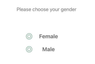
It’s still quite common to ask people to choose between female and male only. This automatically excludes everyone who doesn’t identify with these two options. What can we do if we work on a form that asks for gender in this way? We can always question why we need to ask for it. If there’s a valid reason, we can suggest adding a piece of microcopy that explains why this information is needed, along with more inclusive options. Ideally something that doesn’t include the word “other,” which signals that everyone who doesn’t pick female or male is a weirdo.
Tips to create better microcopy
There are three golden rules you’d be wise to always pay attention to when you create microcopy:
- Be clear. This is the most important thing, ever. If users don’t understand what’s going on, they will drop out. And how do we know what is clear? By doing background research and listening to feedback from users. Using our own judgment, or only listening to our clients and product team members, is not enough. Because when we work on a topic day in and day out, it becomes impossible to imagine what it looks like for somebody who sees it for the first time. Being clear includes avoiding jargon unless absolutely necessary (and only if you’re 100% sure your readers know what it means).
- Be concise. When writing digital interfaces, there are often space restrictions. But that’s not the only reason to aim for as few words as possible (without losing clarity): The more words we use, the higher the cognitive load. In the book Strategic Writing for UX, Torrey Podmajersky recommends aiming for a maximum of 3 words per button. That may not always be possible, but a good rule of thumb to aim for.
- Be helpful. Take an interest in your product’s users and try to predict their concerns.
To up your microcopy game further, be sure to stay true to company values and brand personality. Many companies specify how UX writers should incorporate the brand in a style guide. If you don’t have one, be sure to take an interest in the company brand and think about how to use it in your microcopy. Or consider creating a content style guide yourself.
Another tip is to use a conversational tone for more natural and human-like rather than robotic or corporate language. Thanks to the internet, the gap between writing and speaking has shrunk drastically. Nice, isn’t it! We can chill out, stop writing long and complicated sentences, and just communicate like we do face to face. OK it can be harder than it looks because spoken communication can be quite chaotic. Without cues like someone’s tone of voice and body language, a spoken convo may be just as cryptic as an academic philosophy paper. So again, our main priority is clarity.
The future of microcopy in design
Microcopy, UX writing and content design have been around for a while by now. As a discipline, there’s been a lot of progress. Think of the things we now take for granted when we navigate online: The little explanation of where to find the CVC code on your credit card, for example.
Still, there’s a lot of work to be done, and also microcopy is not something that we can do once and be over and done with. It needs to be reviewed and revised as we go along, and for every new product feature there is new microcopy to be researched, created and tested.
Creating quality microcopy consistently is no small feat. This is why it’s still pretty easy to find lousy examples. Even in large companies with lots of UX writers who usually do a great job. Here’s a recent example from Spotify:
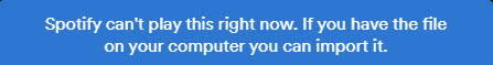
This error message gives me no useful information. Why can’t it play right now? When will the service resume? And no, I don’t keep music files on my computer any longer (one reason I love Spotify is that I don’t have to fill up my hard drive with audio files). So… there’s nothing I can do? If we really don’t know what has gone wrong and when it will be solved, it’s better to say so!
Be careful with humor
Just a few years ago, I often found it refreshing when I came across jokes in microcopy. Maybe because it was such a relief not to have to deal with errors like “Could not resolve mscorlib for target framework ‘,NETFramework,Version=v4.0’.” Being funny in interfaces is hard though. And it can easily feel over the top and even inappropriate and insensitive at times.
One of the most interesting things about the Facebook group Microcopy & UX writing is that there’s never any agreement about what a good sense of humor is. Lots of people post examples of microcopy that made them chuckle, and every time there are others who find it rude, over the top, or just not funny.
It helps a lot if the voice and tone specifies how to handle humor in a given user journey. I like it how Mailchimp’s style guide states “if you’re unsure [about using humor], keep a straight face”. That’s good advice. And just because we don’t go overboard with humor doesn’t mean that we have to be boring and stiff. We can still aim for a conversational tone, it just doesn’t have to be ha-ha-funny all the time.
Try harder to be inclusive
Non-inclusive design can have a massive effect on user experience in terms of accessibility, diversity, and gender. Most of us have a lot to learn in this area. That’s OK as long as we make an effort and try to improve. A good start is to ask lots of questions.
As UX writers and content designers, we can use microcopy to contribute to a more inclusive world. For example, many text fields use placeholder copy with terrible contrast. That placeholder won’t be of any use to people with poor eyesight. In this case, we can consider how to make that information available in other ways. Maybe like this:
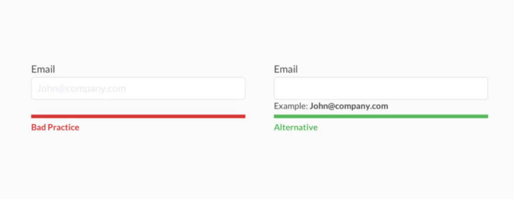
Example found in the article Alternatives to placeholder text by Andrew Coyle
Some people get annoyed when accessibility issues are mentioned. I get the impression that they see it as an attack on their creative freedom. Well, tough. We should take up the challenge to be creative and inclusive.
Keep localization in mind
Here’s another reason to aim for clarity: The copy we write may end up being translated into other languages. Short, simple sentences make your copy easy to read not just for the general public, but for translators and machine translation programs too. Cultural references, metaphors and puns are also notoriously tricky to render in other languages. If you feel the need to include them, be sure to include an explanation to the localization team.
Conclusion
Microcopy can be found everywhere in today’s digital products. These small words and phrases can make a huge difference to the overall user experience. It has also been shown to affect conversion rates. Creating consistently good microcopy takes a lot of effort, though. Especially as the tech industry is constantly changing. With new technologies coming out every year, UX writers need to be on their toes and keep up with the latest trends to stay competitive.
The best part about this ever-changing industry? We get to be part of shaping its future!
Resources for more information
Article: 35 examples of great UX writing to spark inspiration
Facebook group: Join Microcopy & UX writing for tons of inspiring microcopy examples and lively discussions.
Newsletter: UX Writing Hub’s newsletter includes great microcopy examples (and lots of other good things) every week.
Video: Conference talk by Joshua Parker about the importance of microcopy in 2013 – still worth a watch! His conclusion is that “microcopy is the fastest way to improve your interface.”
Podcast: Writing for UX and customer success with Torrey Podmajersky. Mega knowledgeable and friendly Torrey goes through the basics of microcopy.
Book: Microcopy – the complete guide by Kinneret Yifrah. Also known as “the microcopy bible”. Great reference resource 📘
Want to become a (better) UX writer?
We help people transition to or move forward in the field of UX writing and content design. Check out our UX writing courses.