
Why read this?
If you’re a UX writer or a company looking to enhance your digital products, this case study may be helpful. It shares insights on simplifying complexity through UX writing and how involving a UX writer early on can make a difference.
Overview
Welcome to a case study that explores Butter MAS Composer’s onboarding redesign. As a dedicated UX writer, content strategist, and copyeditor, my journey revolved around transforming intricate technical steps into user-friendly language.
Robot animations made easy
Butter MAS Composer is a software that simplifies robot animation for non-developers. It provides value by shifting the control of robot animation to researchers and designers. For this reason, the software holds immense potential. However, its initial onboarding was intricate and unintuitive.
Our team
- Founder of Butter Robotics
- 1 project manager
- 9 UX writers
My role
In January 2023, I took a deep dive into the product market with two other UX writers as part of the UX Writing Academy program. Our goal was to create personas that would guide the team’s design work. Integrating our research into the design phase, I connected key features with each persona we developed.
During February and March 2023, I collaborated with five other UX writers to rewrite the UI copy and UX content for the product’s onboarding. Simultaneously, I partnered with Butter Robotics’ founder to better understand the software’s technical terms.
The challenge
We aimed to:
- Simplify: Make onboarding user-friendly
- Empower: Help all users create robot animations confidently
Our research
At the beginning of the project, we extracted valuable insights from conversation mining and competitor analysis.
After researching the broader industry, we conducted user interviews. Insights from these interviews would shape our UI copy and UX content rewrites.
Interviews included:
- 1 stakeholder
- 2 users with robotics experience
- 2 users without prior robotics experience
Interviews revealed:
- Navigation issues: Unclear onboarding steps
- Process confusion: Uncertain hardware requirements
- Complex language: Inconsistent terms
- Lack of guidance: Missing real-time feedback
“It’s not intuitive. If I would have been given the website and the robot by myself, I wouldn’t know how to do it.”
Our findings showed friction was largely due to unclear terms. Additionally, the software’s language lacked the type of conversational tone that can alleviate user stress. To address this, I knew I had to get clear on the user’s language.
Strategy & approach
My focus was on:
- User-friendly language: Tailor messaging
- Structured flow: Rethink onboarding sequence
- Visual-text synergy: Combine visuals and text
- Consistent brand: Maintain brand voice
- Technical collaboration: Work with experts for clarity
User-friendly language
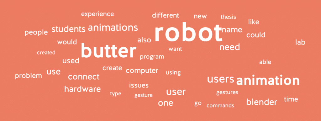
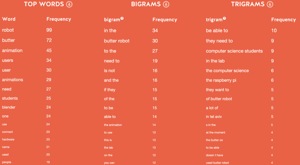
I used databasic.io to analyze common words and phrases from social media, competitors, and interviews. This analysis helped build a ‘word & phrase toolbox’.
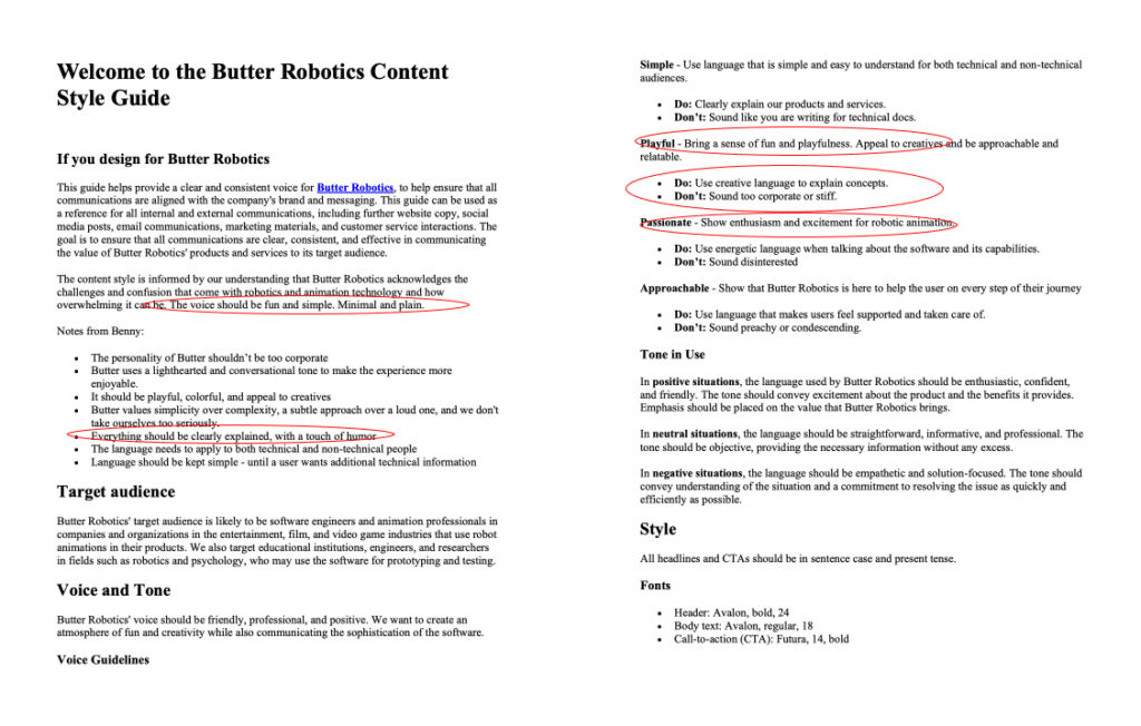
Besides the toolbox, I knew it was important to follow an established style guide. While the company had its own guide, our audits showed inconsistencies on the software and marketing website. Working from a style guide would be crucial. Our team was splitting up the redesign between five UX writers and we needed to remain consistent across the design.
Preparation in steps
While I had my writing toolbox ready, I realized I needed clarity on technical terms before creating a seamless experience.
The friction is real
Our virtual onboarding demo with the founder didn’t clarify all the technical terms. In fact, the extent and intricacy of this onboarding experience left us feeling a bit daunted. Thankfully, we recorded the demo! Reviewing it second by second, I was able to clarify each term and step.
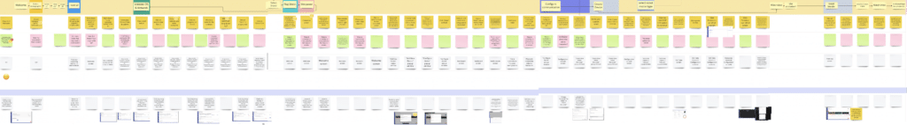
After the analysis, I made a visual flow map in Figma breaking down all 43 onboarding steps. With this guide to work from, we could better understand each user pain point in its relevant context.
Seeing from the user’s view
As an outsider, experiencing friction firsthand was an asset. It fueled my empathy for users and a strong desire to understand the onboarding process.
Simplifying the process
Understanding terms, I focused on simplification. Reducing cognitive load meant reducing word count. It also meant speaking directly to users. Good thing I had my writing toolbox cued up and ready to go!
Rewriting the dashboard copy
Before:

After:

Dashboard copy plays a crucial role in guiding users through your platform. Just like the search bar, it’s a key tool for users to navigate and understand the interface. Every word counts here—the copy needs to be clear, concise, and action-oriented. Users should grasp their next steps without hesitation.
Rewriting ‘install OS’ copy
Before:

After:

Think of info icons and helper elements as the trusty sidekicks of your UI and UX design. They’re like friendly guides saying, “Click here for more info”. They simplify complex processes and clarify user doubts. Every detail matters, from the size of the icons to the tone of the tooltips. The goal is to provide users with support and confidence in their actions.
Rewriting ‘connect to network’ copy
Before:

After:

Minimizing cognitive load is like decluttering the user’s path. It’s about trimming what’s unnecessary and presenting info in bite-sized pieces. This means well-organized layouts, intuitive labels, and smart visual hierarchy. By reducing cognitive load, you’re providing users a highway instead of a maze.
Rewriting ‘name your device’ copy
Before:

After:

Simplifying jargon is like providing a friendly translation service. Clear terminology is the key to a smooth onboarding. It’s all about speaking the user’s language and ensuring that complex terms don’t become roadblocks. When users instantly get what you mean, they can confidently move forward.
Rewriting ‘success’ copy
Before:

After:

Success screens are virtual high-fives. They celebrate the user’s accomplishments and offer valuable guidance. It’s all about making users feel empowered. When success is acknowledged and missteps are addressed, users can start to build trust in your platform.
Results & future steps
The product team embraced the onboarding redesign.
- Positive reception: Stakeholder and user approval, on-time delivery
- Continued evolution: UX designer collaboration for visual enhancement
- Future plans: Implementing rewrites in software update, usability testing
- User focus: Ongoing user-centered improvements as software advances
Engaging UX writers from product discovery sets a solid foundation for user-friendly products. Butter MAS Composer is restricted by having to wait for software updates to apply our revisions. In the meantime, this can result in less-than-optimal user experiences. This situation highlights a common problem: developers often launch prior to conducting UI copy and UX content assessments. Ultimately, including a UX writer from discovery saves both time and resources.
Empowering user journeys
Successful UX writing bridges the gap between complexity and user ease. Through our skillful use of language, agile learning, and user research we transformed Butter MAS Composer’s onboarding.
This journey highlights UX writing’s role in technology access. As a UX writer, my focus remains on connecting innovation and user needs, while contributing to the success of the digital products I work with.
Explore further
Feeling inspired to explore more? Check out my UX writing portfolio https://bit.ly/annapardenekportfolio for more case studies and samples. Happy exploring!