

Working as a UX writer of government services, I have a unique opportunity to apply methods that help create clear, simple and easy content – information and instructions – for our users. This has real impact on our users, who MUST deal with bureaucracy, but no longer need to grind their teeth while trying to understand what they need to do.
Today I am going to share all of those UX writing methods with you. These are all guidelines, tips and tricks that work for me, and not rules or laws.
You’ll probably recognize a lot and are already doing it, and hopefully you’ll find the article helpful.
Writing clearly for users who need to get stuff done
A lot of my work is writing for a government agency in Israel that creates mountains of information, that users need to get government services.
Most of what I write is first written by someone else in Hebrew, and then I translate it to English.
Therefore, 99 times out of 100 (literally) I improve on the UX content writing, often entirely re-writing a page.
Over the years, I’ve become an expert in writing content for government service providers.
Always know your users
It’s crucial that I understand, that my users are a captive audience. They have no choice about the services that they need and they have to act on the information that they are given.
When someone needs a passport, they have to do something about it, and there really is only one way to get it. They must use the information provided to get services from the government.
The only other option is to call the service provider (no one wants to actually talk to the government), and see if they can get some clear answers – Good luck!
If they have to do that, the content isn’t clear enough and I haven’t done my job well.
What I write affects users in a very real way, and that’s a big responsibility.
How to write clearly for users who need to get stuff done
First off, I’ve already defined a basic need. “Getting stuff done”. The user is there for one reason only – to take a specific action – and they’re busy, so they appreciate it if things are simple and clear.

Busy users* don’t need or care about:
- All the superfluous crap, i.e, anything that isn’t really, really relevant (for them to take action), like, historical reasons behind the process.
- Who is giving them what they need (unless it’s critical to understand the process).
- Internal jargon – Jargon is the enemy!
- Long winded prose.
- Laws, statutes, procedures etc. Especially if written in legal-speak-lingo-jargon.
Any of this that absolutely must be in there, should be in a chapter or area that is lower down on the importance hierarchy, and gets less focus on the page (UI).
*Being busy is the default state for users, as far as UX writing is concerned.
What users care about and need
…(to get things done)
This a list I use.
It works for me.
You could probably add or take things off the list, but it’s a great place to start (lists are great!). The first list item is for me, not my users.
-
Make sure you understand what you are writing.
-
Specific relevant information – less is more (to a point)
-
Easy to digest, bite-sized chunks of information
-
Scannable information
-
Clear hierarchy of information
-
Simple, clear language – Kill the Jargon!!!
-
Direct language – Don’t talk about something, talk to someone
-
Links to more information that is beyond the scope of the page
-
Consistency (not uniformity)
1.Make sure you understand what you are writing
This sounds trivial, but it’s anything but that. If you don’t understand what you are writing, your user won’t either.
My job is to take the Hebrew and translate it to English, but most of the Hebrew is written by civil servants who don’t know how to write (Sometimes, I’m working from documents that could have been written 30 years ago!).
They haven’t a clue about service writing, and may have heard of UX but think its synonymous with graphic design.
It’s not their fault, and some of them do a great job, but mainly, the content isn’t good enough. Hopefully, they’ll all take a UX content writing course, and start to understand how its done.
Because I have to first translate the content, I have to read the content very, very carefully and understand it completely. There’s simply no way to translate it otherwise, let alone make it clear for someone else.
This is something every content writer should be doing anyway, but in my case, I have no choice, which is an added bonus.

Fully understand what you are writing.
2. Specific relevant information
Less is more (to a point)
No one really reads online. Well, that’s not completely true – But not if they want to get something done.
I go through guides on how to do stuff in photoshop or other programs, or on my phone at lightning speed. I am scanning for specific relevant information to get what I want done. So are my users.
This means I need to write short, uncomplicated sentences, and if necessary, short paragraphs. I try to keep them up to 3 sentences at most.
Having said this, it’s really important to remember:
Keeping things concise is a tool not an ideology.
Recently, someone developing an online form said to me, “UX is about minimalism”.
I don’t agree.
UX is about creating the right experience for your user. Minimalism is a tool. It’s a UX designer’s job to understand (and test) if minimalism is the right approach for the experience they are designing.
The same goes for being concise.
Don’t sacrifice clarity just to make something shorter.

I could abbreviate that to “Don’t sacrifice clarity”.
What is specific information
Here’s what usually goes into the services I write:
- Who is it for – e.g, Who can apply
- What do they need – like, documents, forms, etc. If they can’t get what they need without their ID card, you need to tell them that.
- What is the action – Application, Claim, Payment etc.
- How much does it cost
- How to apply – A list of steps
- Relevant background information (Only if relevant. Only if necessary or at least, very helpful).
- Contact info
For my users, this is all the specific information they need. Once you have defined your “bits of specific relevant information”, you basically have your sub-titles or headings that you can turn into bite-sized, digestible chunks of information.
When you plan your guide, instructions service, blog…whatever, creating a list of what needs to go in is helpful. The list might change as you progress. That’s ok. (Lists rock! – I may have said that already).
Of course, you also have to be specific within those categories too. Being specific is both a way to organize information and a way to avoid ambiguity
I once had to publish a very “un-specific” piece of information, (and I still can’t believe it):
“You must appeal within 72 work hours”

This was the legal definition that the ministry insisted on (and we really argued with them over it), even though it is ridiculously unclear.
Some people work 4 hours a day and some work 12. Civil servants have completely random work hours, and In Israel, a Friday can be a half day or a day off. What happens on holidays? Etc.
To make things worse, the ministry would not agree to publish their work hours. User experience nightmare!!! How many people do you think managed to appeal?
It should really be something specific and unambiguous, like:
“You must appeal within 3 work days”.
Another example is “proof of address”.
Telling someone to submit “proof of address” is pretty broad, and should be clarified:
You must bring proof of address, such as:
- A utility bill (gas, phone, electricity, council tax).
- A letter from your bank addressed to you.
- A lease contract.
“Specific” means clear and unambiguous, and focused on what the user needs. Your user shouldn’t be left with questions.
3. Bite-sized, digestible chunks of information

Sometimes, applying for a service (or learning how to do something new on a program, for example) is a long and arduous task, and often includes a lot of information.
When the information is lumped together, it’s almost impossible to digest, and even so, it’s hard to remember (retention).
If you need to go back to refer to it later, it’s hard to find. Basically, bad UX.
Bite-sized, digestible chunks of information is kind of like flash cards for a test.
- Anything that is part of a category should be organised together.
- For example, ingredients for a recipe and method for a recipe are 2 clear categories.
- If possible (and it’s almost always possible) break information down into lists.
- I use bullet lists if there is no specific order, and number lists for processes (this is not a rule!).
- Even if there is no specified order, it still makes sense to work out some internal hierarchy. Here’s an example:
Example:
Lease contract, utility bills, ID card, high school diploma, driving licence
This should be:
What you need
- Your ID card.
- Your driving licence.
- Your lease contract.
- At least one utility bill (such as gas, telephone, electricity, council tax) addressed to you.
- Your high school diploma.
In the above example, the user doesn’t need to submit all these in any order. They are all equally important, so I’ve used a bullet list.
I’ve not listed the items randomly. I’ve arranged similar items together. It’s just easier for the user to remember it that way. There’s an internal logic.
On top of this, I’ve also added more relevant information without creating a big clumpy mess of information, so I’ve clarified without sacrificing usability.
- Each list item should be short and clear – No longer than a simple sentence if possible.
- Paragraphs should be up to 3 sentences at most.
- If you have an option to open and close chapters, use them if their is a lot of content and if it makes sense UI-wise.
The point is that it is easier to absorb and retain information if you get it a bit at a time and if each bit is simple and clear.
You can’t eat a feast in a single bite (because you are a human and not a python). It’s quite important to remember that your users are humans too (not pythons).
Even if there is a lot of information, it is easy to find what you need, if its organised and scannable.
4. Scannability (is that a word? Yes)
So, now that you have bite-sized, digestible pieces of information, they need to be scannable. If you’ve done the above well, they already are.
- You’ve organised information into logical categories.
- You’ve broken it down into short and simple sentences, paragraphs and lists.
- You’ve got rid of anything that isn’t really relevant.
But first,
What is scanning?

Scanning is when someone goes over a big chunk of information quickly and identifies key information.
I do this when I’m trying to pick out my daughter as all the kids pour out of kindergarten, or when looking for my favourite chocolate bar on a massive supermarket shelf.
It’s primarily about recognizing shapes that stand out and interpreting them as relevant or irrelevant. You are also mapping out a picture of what is in front of you (grasping the information hierarchy).
When I said No one really reads online…not if they want to get something done, it’s because they are scanning, not reading.
I like how Angela Gorden sums it up in her article, “Are you skimming or scanning right now?”, on Medium
“Reading happens once users have got passed the scanning stage, and worked out what’s relevant.
When you scan, you are a hunter.
You’re on a mission, and you know precisely what you’re looking for. You focus on your mission, ignoring pretty much everything else.”
What makes something scannable
There are two very basic principles to make something scannable:
- It needs to stand out visually.
- It needs to be a small, bite-sized, digestible chunk of info.
Making something stand out visually is pretty easy.
- Make it look different with font size, bold, colour
- Give it its own space
- Pair it with an icon or graphic
We’ve already gone over how to make something a bite-sized, chunk of digestible information.The same rules apply for scannability, on steroids.
We’re really talking about the most concise bits of information, like titles, or clear, 3 worded sentences, or just single words even.
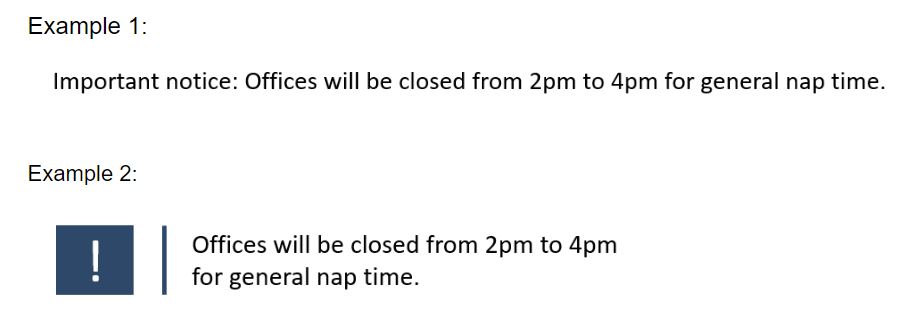
Example 1 will disappear very quickly if it is on a page with more than a few sentences.
Example 2 will stand out on any page of text (as long as the page isn’t already full of graphics and colours)
So, for scannability:
Stand out visually. Short. Clear.
5. Clear hierarchy of information
This means that you’ve put thought into what comes first and last, and the order of the content.
You could start with all the most important things someone needs to know.
You could follow the flow of what the user needs to do (the user journey) to receive the service.
I like to follow this user journey flow:
Is it for me → What do I need → How much is it → What do I need to do → More info
This means my pages are arranged like this:
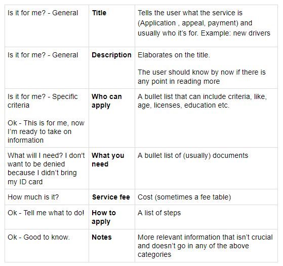
…and they look like something like this:
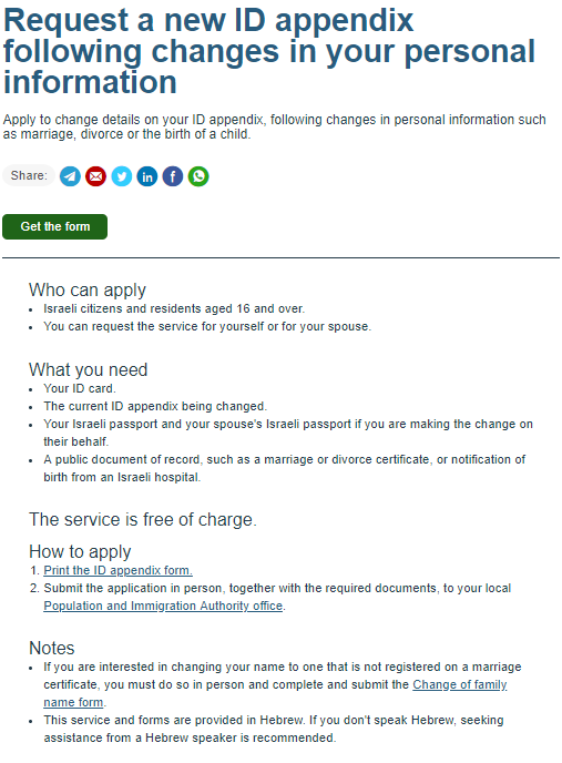
All together, it’s organised in a clear way, the content is scannable and it creates a clear idea of what needs to be done.
6. Simple, clear language – Kill the Jargon!!!

This is probably my favourite.
Everything, so far, has been about structure of content and hierarchy of information. So, we know that a list like this:
You must bring your ID card, driving license, 2 passport photos, a book in case you get bored, and a sandwich in case you get hungry.
Should look like this:
What you need
- Your ID card
- Your driving license
- 2 passport photos
- A book (recommended)
- A sandwich (recommended)
But no matter how well you do all of that cool structure-hierarchy stuff, if the language you use is not the language that your user uses (eugh…tongue -twister), you’re in trouble.
Well, they’re in trouble,because they won’t understand it and it will be useless to them!
From: Joe Natoli’s, (Excellent!) Design Rules: Principles + Practices for Great UI Design (Udemy course)
GOV.UK are great at this, and they based what they do on PLAIN ENGLISH which was a whole movement that started in the late 70s to make bureaucratic English understandable, by using simple, understandable English for everyone.

Now, you may be told that you are writing content for users who use jargon, like lawyers, doctors, quantum mechanics (they usually bring their own cat), etc.
Well, research shows otherwise, and you can read about it here on GOV.UK. Here’s my favourite bit:
…“when given a choice, 80% of people preferred sentences written in clear English (for example, 97% preferred ‘among other things’ over the more traditional Latin phrase ‘inter alia’) and the more complex the issue, the greater that preference. But second, it found that the more educated the person, the more specialist their knowledge, the greater their preference for plain English.”
Even if you have a style and tone that include slang, and have worked hard to create a unique voice for your platform, when giving information, keep it simple, and make sure your user understands the language.
This means getting rid of jargon and getting rid of legal talk – Yes! You can tell people about a law without reciting the law.
You can tell people about a highly sophisticated and specialised process, without using highly specialised and sophisticated language.
If you must include all sorts of legal jargon, stick it out of the way, and explain the bits that need explaining so the user can take action (because that’s what they came to do).
7. Direct language – Don’t talk about, talk to
Being direct means talking to someone, and not about them, and definitely not about the action they need to take as an abstract, or talking in a passive form. It also means telling the user what they need to do, actively, so, use verbs.
Talk to the user. Not about the user. Tell the user what they need to do, not what must be done.
Here are some examples:
Passport Application → Apply for a passport
Persons requiring a new passport must make the application at a Population and Immigration office after first making an appointment.
→
Apply for your passport at a Population and Immigration office.
You need to make an appointment first.
Just imagine that your user is a real person and you are talking to them (Not a massive stretch of imagination). That’s what people usually want and respond to best.
8. Links to more information – Link it out
Linking out is a way of extending the scope of the information, without sacrificing usability. You only should be doing this for content that is relevant but not crucial, and is beyond the scope of what you’re writing.
It may be useful for the reader to know about the new biometric ID and passport – the rules and regulations, technology and ethical implications – but it’s not crucial for their application.
Simply stick in a link in the relevant place, like:
Find out more about biometric documentation
These 6 words replaced entire chapters of information that the ministry wanted in the application page.
It was important to them. They were proud of the revolutionary change that culminated about ten years of work and countless millions of taxpayers’ money. I thought it was irrelevant for actually getting the passport. So I linked it out.
I get told to put in legal stuff quite a lot, to prevent ambiguity that might lead to legal action. Usually, its unreadable, so I can’t see how it’s helpful, but in any case, it should be enough to link-out to it, as long as the linking-out is clear.
9. Consistency (not uniformity)
Whatever form and style you choose, you should remain consistent in both. That means that titles should be styled in a specific way, as well as the way you use lists, links, font sizes, and hierarchy etc.
A list like this is confusing:
What you need
- ID
- Your lease contract,
- You need to bring a passport photo.
- Don’t forget proof of address.
Each bullet is written in a different way. It’s less to do with the style,than the inconsistency of the styles. This is better:
What you need
- Your ID
- Your lease contract
- A passport photo
- Proof of address
Here are some titles that use different (inconsistent) forms:
- Pay your gas bill
- Passport application
- How to claim a tax rebate
And now, consistent:
- Pay your gas bill
- Apply for a passport
- Claim a tax rebate
Not uniformity
Avoid setting a fixed rule that is unbreakable – that’s making uniformity an ideology instead of a tool.

Content is dynamic, if the rule doesn’t work, don’t break the content to fit the rule.
This might sound obvious, but I’ve been told to use specific titles that don’t fit the information, just because when the style guide was set up, emphasis was placed on keeping everything as uniform as possible.
This was done to make the information “recognizable”, but it resulted in some pretty weird combinations that just didn’t work. Eventually, “consistency” was adopted instead of “uniformity”, which makes much more sense.
In general, I’d say that all rules are guidelines, and you should be making intelligent decisions all the time.
One of my favourite quotes is:
“One size fits no-one”, Terry Pratchett, author of The Discworld series
Pro tip
I want to end with one massive Pro Tip.
Get someone to read whatever you write and help edit it. It’s not always possible, but when it is, it’s extremely helpful.
This is relevant for all creative processes, and it’s because we start to lose perspective.
Yuval Kestecher helped me with this article, and his point of view and suggestions made a huge difference (Thanks, Yuval!).
About Asaf Shahar
I’m a UX Writer and Content Designer, currently for government services, apps, and forms. I am the gov.il (Israel government website) English Content Manager, which means I make complicated government content easy to use.
I believe that the entire Experience Design process needs to involve all UX fields – content writing, UI, research, behaviour, etc. from the get go to create the optimum experience for users as efficiently as possible.
I don’t like things that don’t work. When I see them, I fix them.
You can find me on LinkedIn, or just get in touch: Tel: +972 058-4281180 | [email protected]
Let’s talk!