Table of Contents
My outlook was optimistic when I began my UX design journey a year and a half ago. Despite over a decade as a professional creative and self-taught web designer, I felt an inevitable need to pursue formal training in the latter. Little did I know that this journey would be rife with both delight and frustration as I actionably learned about the UX process by researching, designing, and testing an app of my own making. Oddly enough, it would be the most frustrating aspect of this experience that would propel me into a specialized career in writing.
Form follows function (right?)
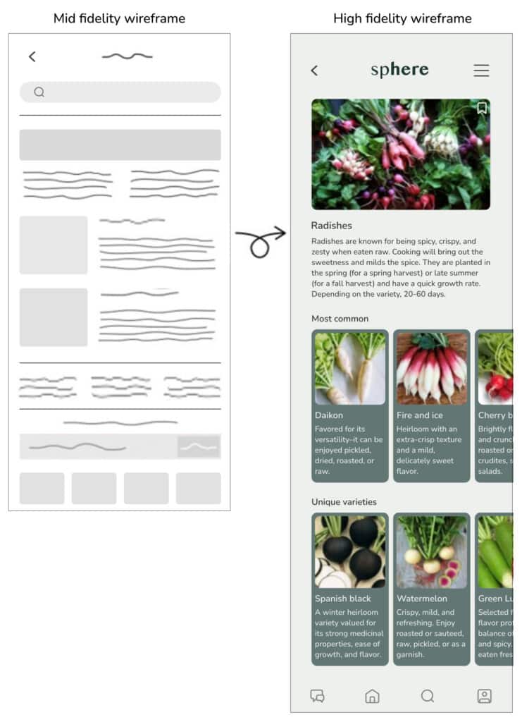
Early on, I began sensing learning gaps as I received my UX design training. These voids were incessantly tugging at me and creating a lot of internal noise. One example was wireframes required without context. It seemed odd to be blocking out real estate on a device without a deeper consideration of what this content would contain. I was rebuked for trying to include ideas for writing and told to return the wireframe with a placeholder of squiggly lines for make-believe text instead. Or, at a later stage, the standard Latin filler of ‘lorem ipsum dolor…’ was the accepted method of advancing from squiggles to text.
This process, known as container-first design, felt nonsensical. I knew full well, even at this initial stage, that this would likely create problems later. And it did. It not only required a complete redesign of some pages altogether but, in some instances, it even meant changes to how the user navigated through the product. Had this valuable writing sat at the table the way the images, colors, and layout choices did, I could have salvaged a considerable amount of time in the process. Instead, I sank this time into redesigning these user flows and screens to ensure that the content had the proper hierarchy and placement to fit into the overall scheme previously envisioned.

Don’t get me wrong; I am a visually influenced individual (and happily so). I love color. I have solid leanings and opinions on certain typographies. And I’ve been known to geek out on a sublimely organized graphic layout. But I’m also a human who relies on language to communicate above all else. Words, even on their own, are the vehicle that drives a user’s navigation through a product. As valuable as color and hierarchy are in creating visual interest, they cannot steer this ship alone. We need words. More specifically, we need thoughtful language representing a specific tone and voice that makes sense for each experience of the user’s journey.
As I was wrapping up my formal instruction in UX design, I began scouring the internet for more information on the writing angle in this field. I was relieved to discover that I could make a specialized career in this aspect alone. I immediately signed up for more training and began this lucrative dive into the world of UX writing and content. It is a complex and broad scope of writing that doesn’t just involve the microcopy on buttons or creating clever error messages. It is this and so much more. It’s essentially all of the writing a user might encounter as they move through a site or experience of a product—whether it be descriptions, instructions, notifications in pop-up windows, or sometimes even beyond the site, including emails or blogs, and newsletters related to the brand.
We need words. More specifically, we need thoughtful language representing a specific tone and voice that makes sense for each experience of the user’s journey.
I found this creative problem-solving of how to communicate to the user at each stage of their journey invigorating. I was completely dialed into the supportive research that helped to inform these decisions. From the competitor analysis to the conversation mining to the personas, I always found a more profound empathy for the user while also considering the business’s goals during each phase of the research process. This continuous cycle of design thinking and pragmatic reasoning influenced the words to include and how to deliver them to reach the most effective impact and driven results.
After gaining this specialized training in UX writing, it was time to complete the next phase of this journey: the elusive first job in the field. But first, I needed to embark on creating my online portfolio of case studies, and once again, I was faced with the conceptual work that I had done previously. With my newfound knowledge, I felt a tinge of embarrassment at the copy I had created. In some instances, it needed to be more robust. In others, I grossly overworked it with text and writing—void of consideration of keeping the content as simple and understandable for the user as possible. There had been no acknowledgment in voice and tone before, so the design was begging to be reimagined in a more thoughtful and curated way.
A holistic experience
After my UX writing studies, I now had a new lens to view what I had created in my previous design instruction. The only way to move forward was to redesign it completely—this time with my newfound knowledge of effectively caring for the user with the writing and content in mind. I determined that the onboarding was the most glaring moment in the user journey that needed to be addressed immediately.

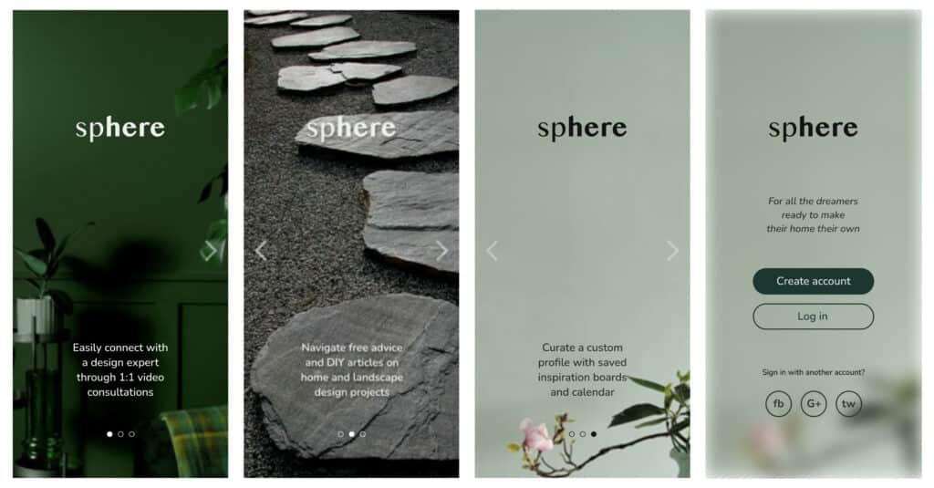
Initial onboarding that was created for the sphere app, a platform that connects users with free advice, DIY articles and paid 1:1 video consultations with interior and landscape design experts.
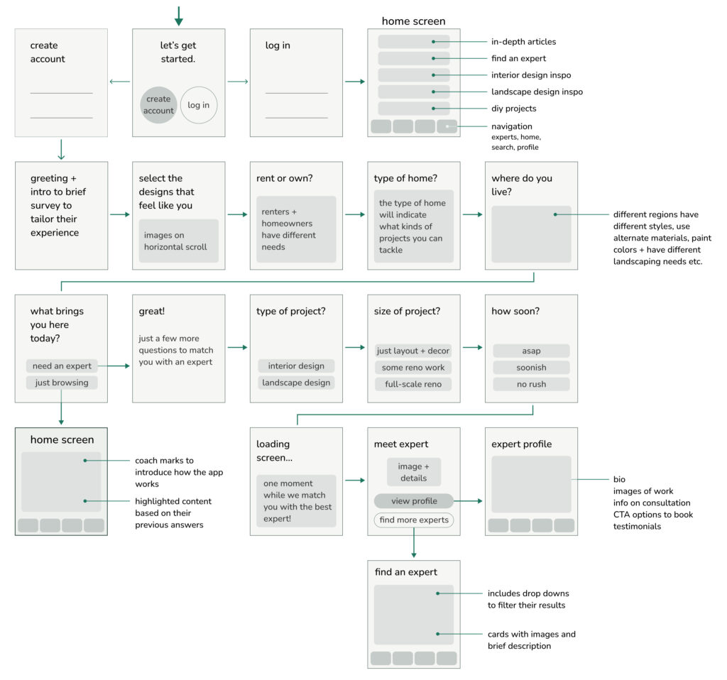
The initial onboarding was, on its most basic level, acceptable. It was a series of three screens detailing a valuable app feature, followed by a signup/login screen with one of the company’s taglines. Yet, with what I knew now, this wasn’t sufficiently able to benefit the user and their goals with the app. Nor could it help the company by getting to know their user’s specific wants and needs for downloading the app in the first place. The only way to best cater to their experience would be a brief onboarding survey to (1) understand their situation so that the app will only update with content specific to their goals and needs and (2) if they are there to hire an expert, assist by helping to find them the best professional for the type of work they want to have done. As a result, I began by creating a series of basic wireframes to emulate this experience for the user, as shown below.

With careful language and curiosity, this short survey can create a connection with the user by showing interest in their needs and assisting them on their first journey with the app. In either instance, whether they are there to browse inspirational images or to find and hire an expert to help them with their project, they are greeted by name on their first screen with coach marks introducing them to the app and custom content catering to their goals. Unfortunately, the previous iteration of this app could never reach this level of empathy. It was merely created to get to the business of the screen designs and navigation through the product instead.
In conclusion, a brief history
These experiences that I’d been having first-hand were new for me, yet, the idea of content-first has been around for a while now. It was boldly brought to the conversation on May 5, 2008, when Jeff Zeldman, co-founder and publisher of A Book Apart, tweeted, “Content precedes design. Design in the absence of content is not design, it’s decoration.”
He was getting to the crux of successful web and app design. We should always prioritize content to engage and retain our audience. The content plays the primary role in how the site functions. The language connects with the users and gives them a purpose for interacting with the design in the first place. So, instead of beginning the process with a mockup of how the design layout will be structured—with containers for images or text to be filled in later—lead with the content and then frame the design to support the language instead. This approach will establish a cohesive plan that offers the appropriate space for information based on its relevance in a flow that will make sense for the user. They’ll move on if this isn’t readily available to them or if it isn’t presented effectively.
“Content precedes design. Design in the absence of content is not design, it’s decoration.”
We can achieve a compelling product by allowing writing and content to sit at the table from the beginning. Unlike what I was taught with the wireframe example earlier, it is counterintuitive to hold imaginary placeholders to fit the writing into at a later stage in the process. On the contrary, writing research should happen from the beginning, guiding the design that always refers to this initial directive. Because let’s face it, people aren’t coming to a site in search of the best page layout. They’re looking for information.
We have a ways to go, however. A robust method of thought that it should be container first and content later is still prevalent even today. While this wave of change has been slow to gain traction and momentum—it may be some time before content-first becomes the common denominator. In the meantime, writers and designers who understand the value of this collaboration need to continue to advocate for the process, always giving content-first a voice until it becomes the accepted standard in the field.
Further Reading
More Than Words: 5 Soft Skills Every UX Writer Needs


