
Whether you’re a seasoned UX writer, a newbie to the field, or a designer who wants to write better microcopy, you can benefit from good UX writing examples. No matter how familiar you are with the nuts and bolts of UX writing craft, examples bring those principles to life. Seeing how great UX writing works on the screen can give you ideas to use in your own work. Looking at examples can also help you hone your ability to spot interesting examples as you use websites and apps in your day-to-day life.
UX writing is the art of crafting words that help people accomplish their goals as they use websites, apps, and other digital products. (It’s also fun to look for examples in the real world, but this post will only feature digital examples.) This post will provide you with examples of great UX writing to spark inspiration and give you ideas for writing error messages, emails, empty states, and more.
This is a great page to bookmark and return to whenever you are stuck on a UX writing task. Looking at how others have solved similar challenges can help you get unstuck and come to a new solution. You’ll find a few products appear on this list more than once – these are often brands that have consistently excellent UX writing, so they might be good places to visit to look for more examples.
Error Messages
Looking for “page not found” examples? We found some. While we hope that users don’t see too many 404 screens or other error messages, creative copy can make a frustrating experience a bit more fun.
1. Merriam-Webster
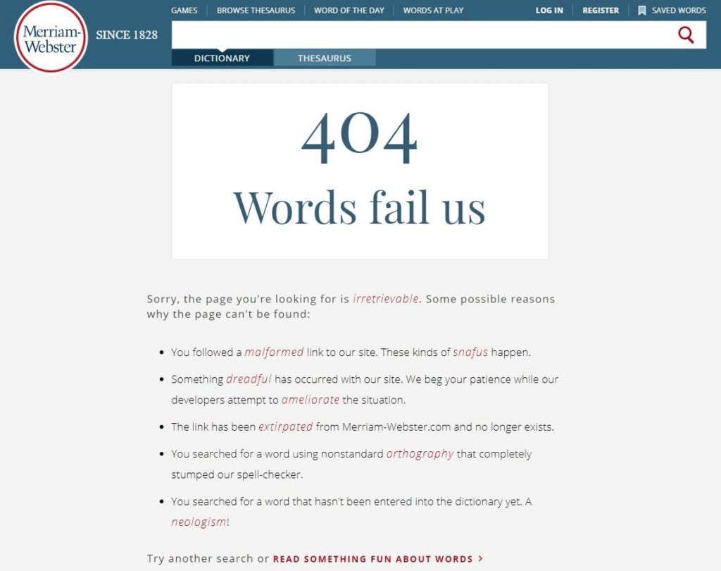
This one is a classic. When setting up a 404 page, it is always a good idea to make sure it’s relevant for your business/product.
The American dictionary Merriam-Webster nails their 404 page simply by doing what they do best.
2. Slack
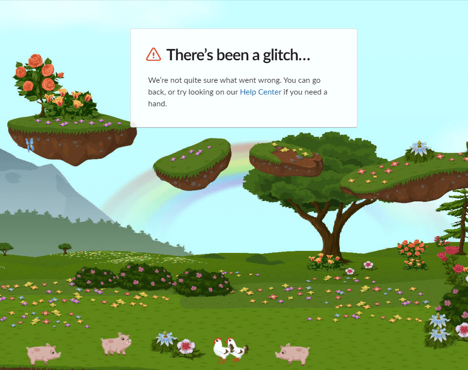
Fantastic interactive 404 page by Slack, with bonus points for simply stating that they don’t know what went wrong.
3. Headspace
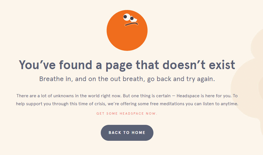
Perfect and on-brand 404 page from the meditation service Headspace.
4. Flixbus
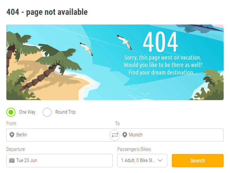
As some parts of the world have started to open up again, enjoy this smart 404 page from bus company Flixbus!
5. Dribbble
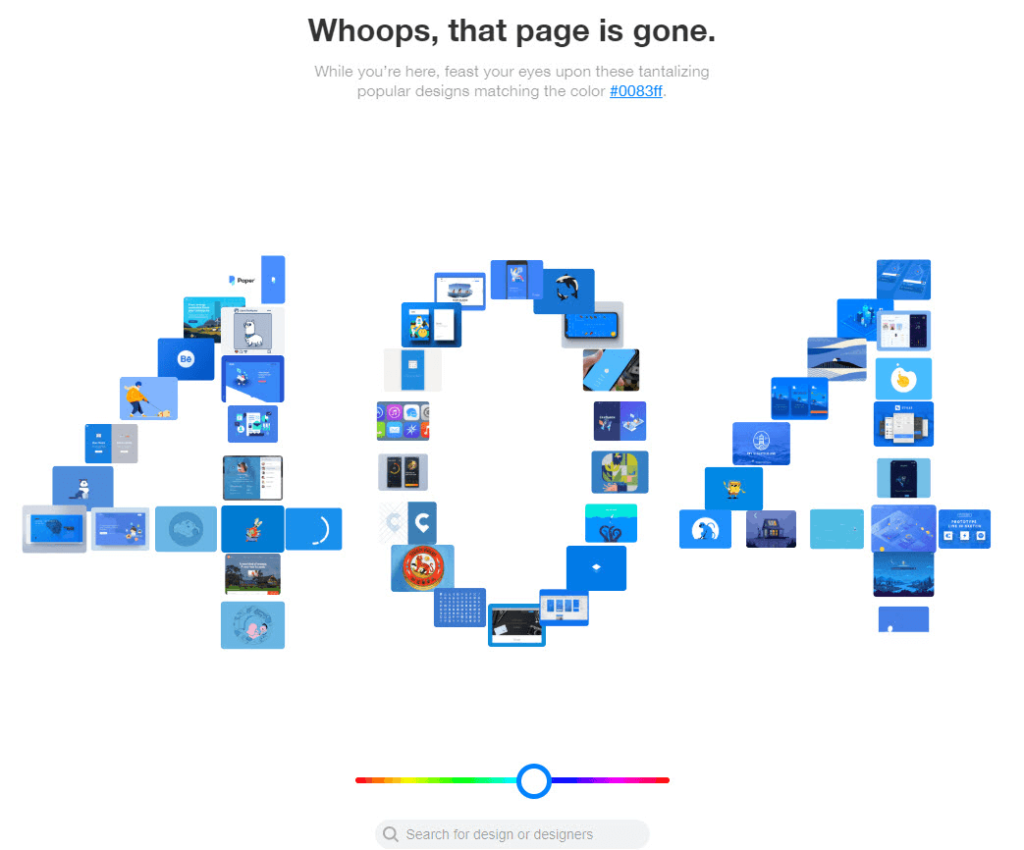
Design site Dribbble’s 404 page features a fun interactive color slider! It suits the product well, and adds a playful element.
6. Uber Eats
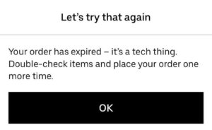
404 is not the only kind of error. This expiration message from Uber Eats let’s the user know it’s not their fault and tells them what to do next.
7. Medium
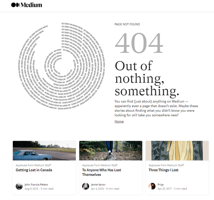
Clever example from Medium, showing stories about getting lost on the 404 screen. This highlights what the site does best – sharing all kinds of content – and hopefully makes people smile even if they haven’t found what they wanted.
Signups and Logins
At a time when most people have too many subscriptions – and too many passwords to go with them – user friendly signup and login screens are incredibly important. These are some effective and fun examples.
8. Oslo City Bikes
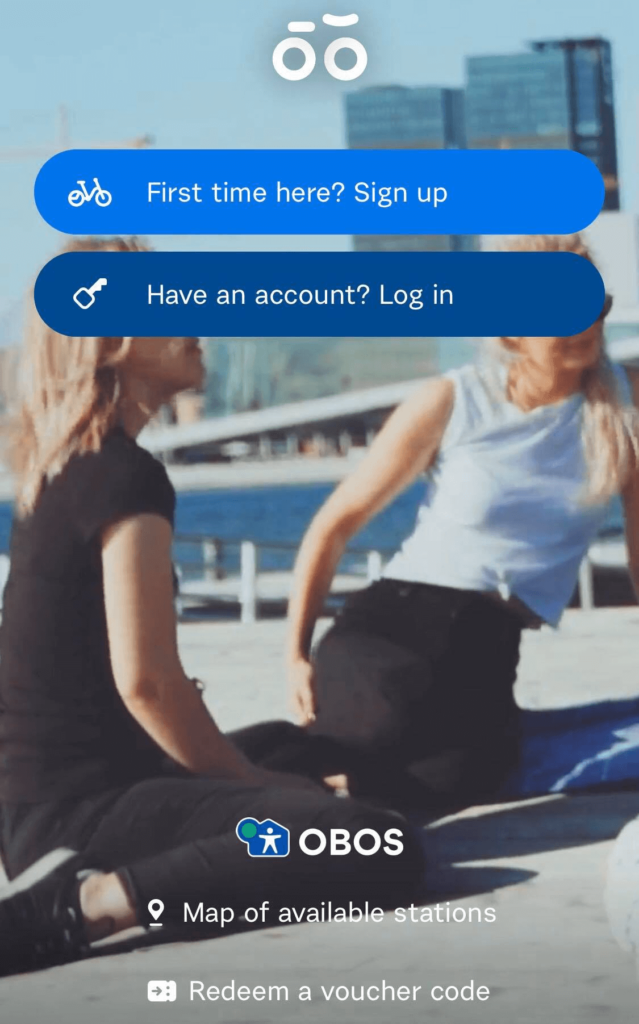
Simple but effective example of how to make sure nobody gets confused about the options “sign up” and “log in”.
9. Todoist
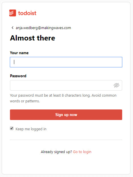
Clean, clear and completely friction-free sign-up experience from Todoist. Sometimes, there is just no need for fluff.
10. Bored Panda
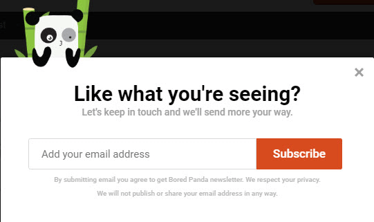
While the cute panda is doing some work to encourage more people to sign up for Bored Panda’s newsletter, the copy is strong too. This signup message is placed at the end of an article you just read and hopefully enjoyed.
11. Dropbox
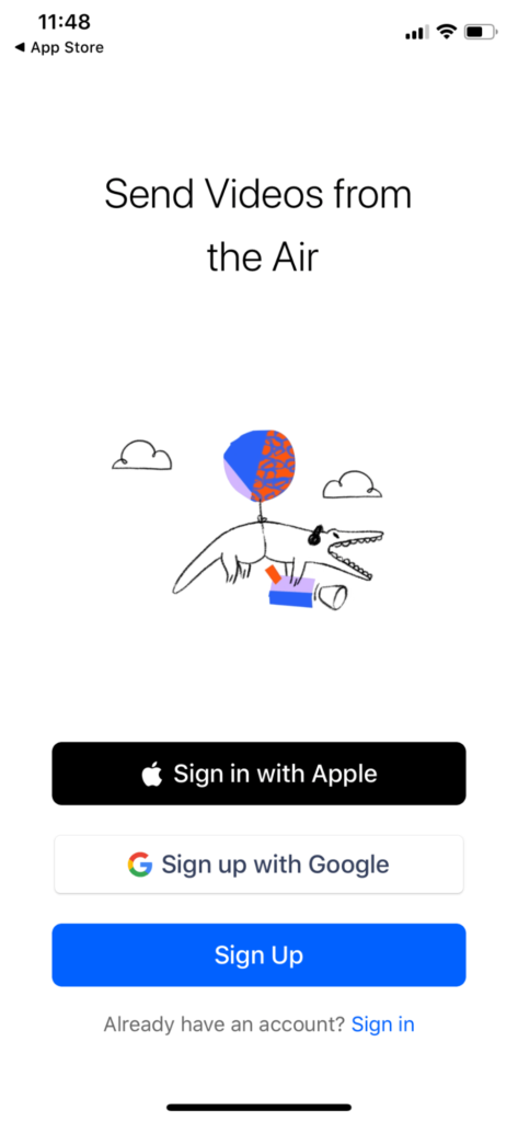
Dropbox’s onboarding flow looks like the result of a great designer/writer collaboration. The different sign in/ sign up options are clear, the copy is clever, the alligator is excellent and weird.
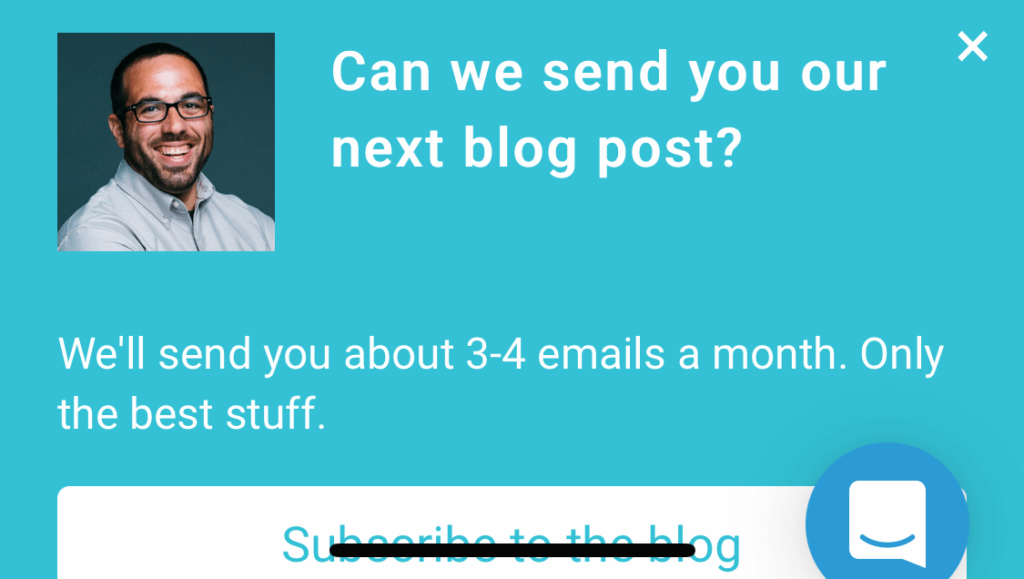
12. Spotify
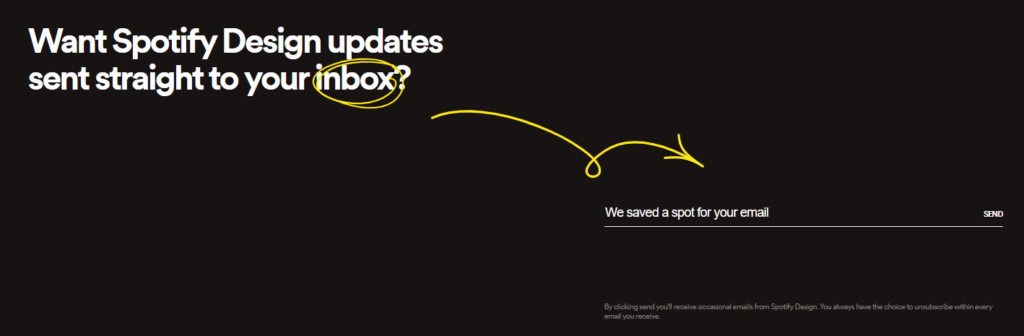
Spotify’s design team has a new way of telling people where to add their email address to sign up for a newsletter. The “saved a spot” copy is fun, and the yellow arrow makes things super clear.
13. Asana
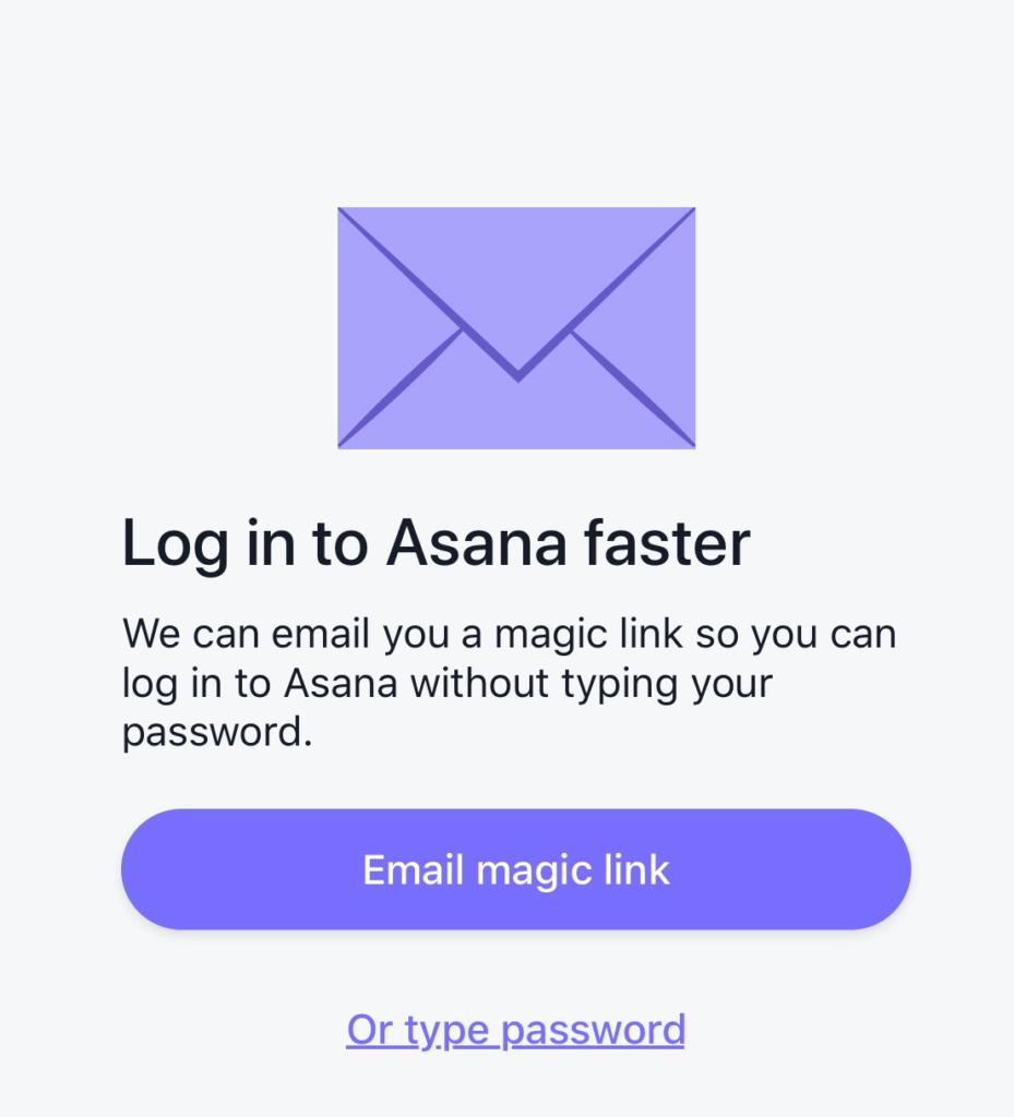
Choose the magic link option when you’re setting up the project management tool Asana on your mobile, and you’re up and running in seconds.
14. Slack
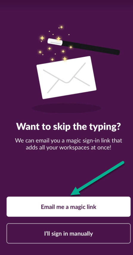
Flawless CTA when merging several email accounts to the same Slack account. I wouldn’t trust just any company to email me a magic link without further explanation, but in this case it works – the user will already be familiar with Slack and knows they have nothing to worry about.
15. Better Marketing
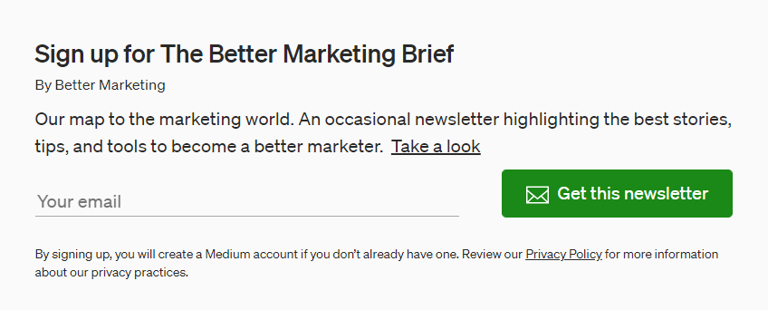
How do you encourage people to sign up for a newsletter? Maybe by letting them take a peek at one or a few you’ve sent recently?
16. Databox
Asking the user a question can be a way to be more conversational in user interfaces. What do you think about it?
17. Lung.org
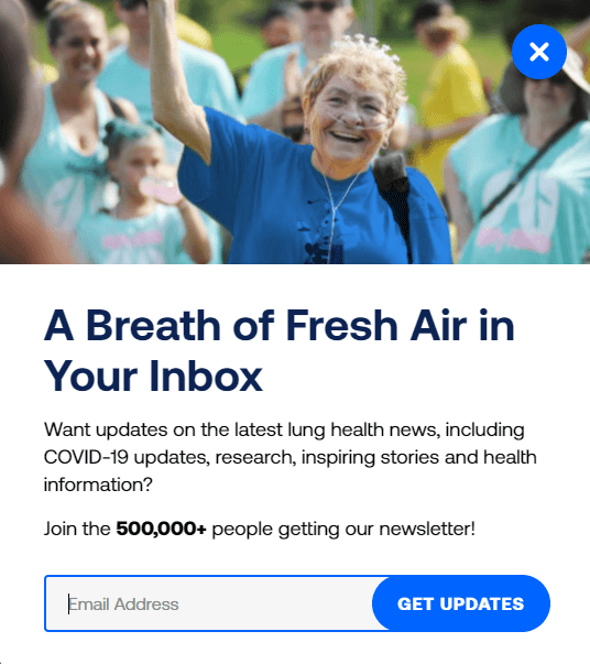
“Breath of fresh air” is nice and on brand for lung.org, and “get updates” makes it clear what you are signing up for.
Emails
Since so many people have overstuffed inboxes these days, if someone gives you their email, it’s important to treat that as an honor. Emails should be important, enjoyable, and (unless you’re writing a newsletter) short. Here are some great examples.
18. Zest
![]()
If there was a world championship in the art of writing conversational emails, Zest would surely have a shot at a medal – full points for personality.
19. Headspace
![]()
Headspace’s copy continues to impress with this perfectly pitched transactional email. Brief and to the point, it shows a lot of empathy without being pushy.
20. Todoist
![]()
A master of the art of transactional emails – Todoist manages to be conversational, concise and useful.
Empty States
Good microcopy can make empty states feel a little fuller – they can make people feel proud of completing all their tasks, or eager to add documents to a library. Don’t overlook this subtle opportunity to connect with users.
21. LinkedIn
![]()
This empty state message has it all: useful info for the user, positive language, actionable CTA, and a nice illustration to match the copy
22. Slack
![]()
You can always count on Slack for spot-on microcopy. This empty state is simple, conversational, and is likely to make the user feel relaxed and accomplished. Great graphic, too.
23. Imgur
![]()
Nice example from Imgur on how to avoid a negative statement in an empty state. Instead of telling the user what’s not there, they let them know what they can do to fill it
24. Dropbox
![]()
This clever example from DropBox provides guidance in a conversational tone and makes people feel good about their work. (Unless you freeze up under pressure to be brilliant 🙂 )
Accessibility and Inclusion
The increased attention to accessibility and inclusion has been a welcome change in the UX field in recent years. Here are some examples of how to improve accessibility in your work.
25. Medium
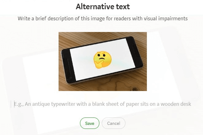
Medium helps you write proper alt texts by providing both an explanation and a full example.
26. Contentful
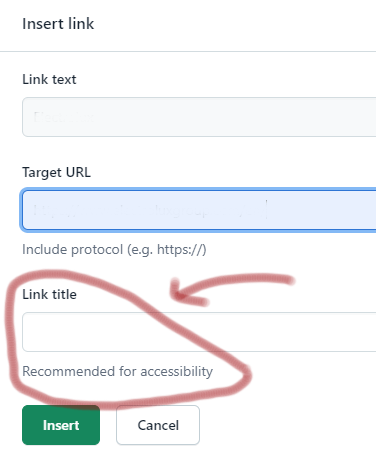
A helpful hint from Contentful that a field is recommended for better accessibility.
27. Equalista
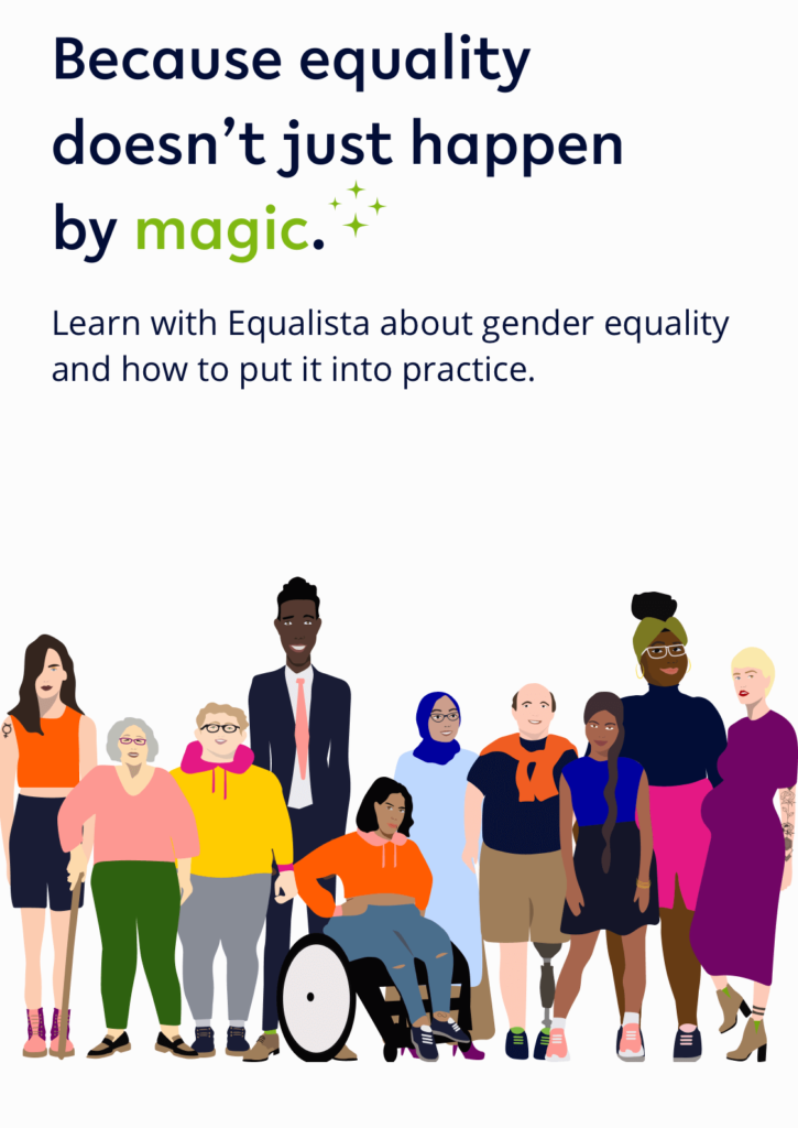
This is not an example as much as a helpful tool for improving inclusivity. A new app for everyone who wants to be more inclusive – includes a glossary of gender terms, and courses on the way: https://equalista.com/.
A few more examples
We’ve spotted lots of great microcopy on our travels through the internet. These clever pieces of UX writing are great to keep in mind wherever you are on your UX writing journey.
28. AirBnb
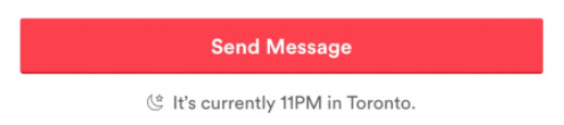
This nifty piece of microcopy from Airbnb tells you the recipient’s local time when you send a message.
29. Team Up recruitment
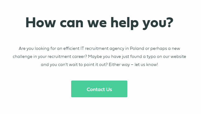
A quirky use of microcopy for a Contact us call to action of a recruitment agency – “let us help you find a job or perhaps you have found a typo.”
30. The Guardian
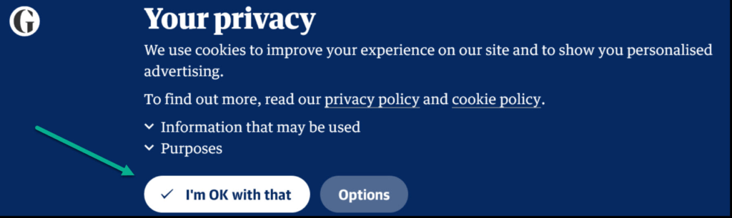
Small changes can make a huge difference – adding a few words makes this much more human and friendly than an abrupt “OK”.
31. Sleepzy
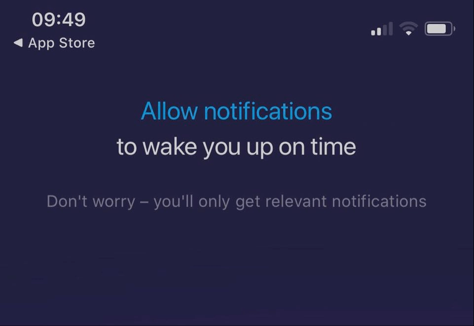
Many of us are getting tired of constant notifications, so how can you persuade people to accept them?
Sometimes, all you need to do is reassure the users that they won’t be spammed.
32. Headspace
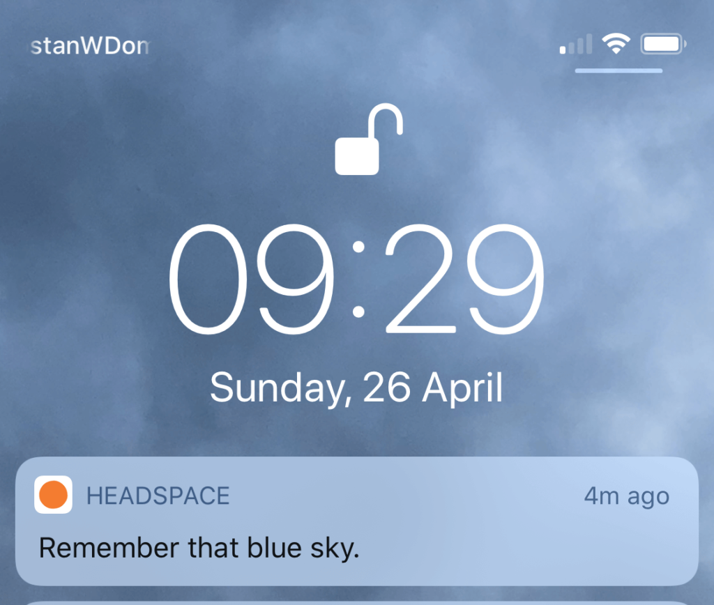
How do you create push notifications that don’t annoy people? Easier said than done, but Headspace does a great job by being positive and encouraging without trying too hard.
33. Zest
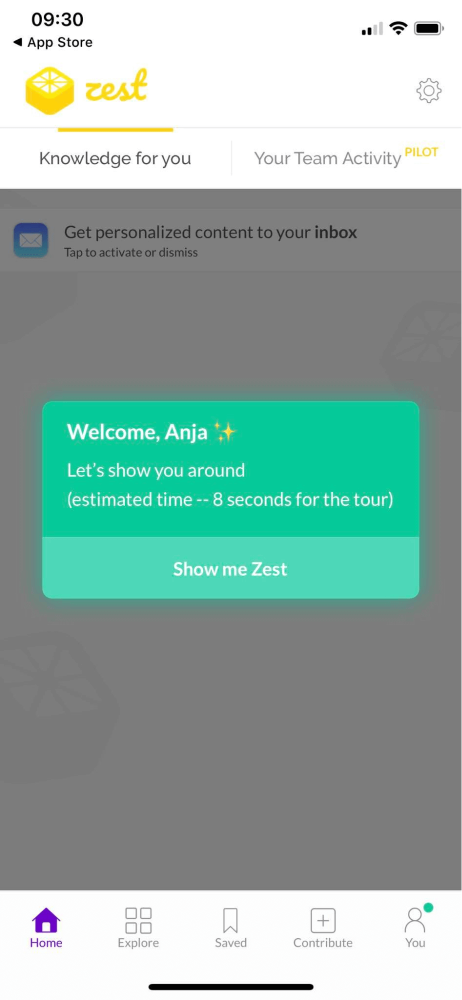
How do you encourage users to take that initial tour during onboarding? Well maybe by making it only 8 seconds long, and telling the reader exactly how short it is.
34. Butter
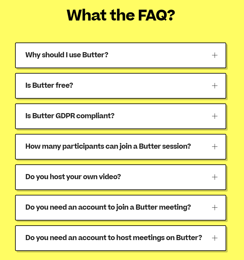
The virtual collaboration platform Butter has a strong brand voice – this may be too edgy for some people, but if you know your audience, bold choices like this can be a great idea.
35. musictaste.spaces
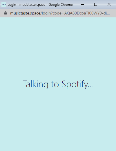
musictaste.spaces uses non-techy language to say that they’re in the process of connecting your Spotify profile to their service. This feels natural and conversational.
Did these examples get your creative juices flowing, and maybe even help solve a UX writing challenge. There are so many examples of good UX writing that we encounter in our lives on the internet. I hope this article helps you stay on the lookout for more as you go about your day-to-day digital life.
More articles for you
Best 10 Examples And Guidelines For Error Messages
Top 13 Pricing Plan Page Examples (And How They Can Influence Your Business)