
Table of Contents
Help, please
I’ve been spending a lot of time lately thinking about help.
Help, within the context of a digital product experience, is the act of building in methods for users to access additional information that isn’t included or apparent within the main interface of that product. It happens when users hit a roadblock when using a product and require further assistance.
Help tools do a lot of the heavy lifting for product education, which is the methodology for making sure the user knows their way around a digital product. The more complex the software or subject matter, the more help the user is likely going to need.
However, when overutilized, underutilized, or misused, these tools have the potential to destroy the entire user experience. As UX writers, content designers, or even technical writers, we need to put on our information architecture hats in order to craft an experience that works effectively.
Without any data to back this, I would guess that one of the main reasons users abandon a digital product or experience is because they are straight-up confused. If a user or customer is engaging with your product to accomplish a goal and they are unable to navigate through your product without asking for help, that’s a huge red flag.
As UX writers and content designers, it’s up to us to make sure users find answers to their questions as they arise. Or, even better, to design experiences that not only anticipate those questions but eliminate any reason they’d need to ask them to begin with.
Levels of product education
Wouldn’t it be great if users could just read our minds and stay on the happy path forever? Let’s all take a moment to laugh, then cry, because you and I both know that that’s just not reality! The further a user needs to go down the rabbit hole of help, the worse you’re doing as a UX professional. Working as a content designer at H&R Block, I deal with tax software, so this is a tricky one because people are ALWAYS going to have questions. But the general rule of thumb remains—if they have to Google it, you’ve failed them.
Here’s a text-adventure version of a journey map: A user wants to accomplish a goal but is unsure what to do next. They first look at the screen they’re on for evidence of an easy solution. They may look at some contextual help on the screen if they are still confused. If they don’t find the answers within the contextual help, they may navigate to a help center or FAQ section on the website or app containing long-form copy info. If they’re still unsatisfied, they may either Google their question or utilize customer support via internal chat, phone call, or contact form–sometimes both, in either order.
Level 1: The screen itself
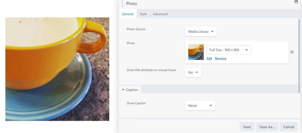
Source: Beaver Builder WordPress Page Builder Plugin
The first method of addressing a user’s potential questions or confusion is by modifying the product’s design, layout, copy, and flow itself. If you have a flood of tooltips on a screen or in a flow, it may mean that you need to reconsider some things in your flow or your copy to make sure a user knows how to navigate your product.
An intuitive interface inspires confidence in the user, and a confident user often becomes an advocate of your brand and product.
(Note that for consistency’s sake, I’m using the same product, Beaver Builder, in my example images.)
Level 2: Contextual help
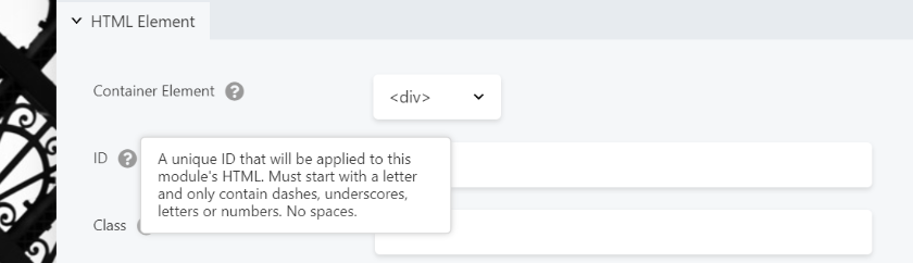
Source: Beaver Builder WordPress Page Builder Plugin
Contextual help is where you give the user access to relevant information to the task they’re trying to accomplish on a specific screen. This help can be in the form of inline instruction, a tooltip, an embedded help center, a “learn more” link, or tours. In other words, it’s not general help about the product, app, or experience, but rather specific or relevant to what they need to know on that particular screen.
It’s not an easy job sometimes to walk the line between not enough contextual help and too much. If we must use contextual help, it’s vital to keep this copy short and sweet. Users should be able to understand what they need to do in as little as a few words, or at most a couple of paragraphs. But always ask yourself—is it possible to avoid the need for contextual help by changing the screen design? Or perhaps we’re overusing tooltips when all that is needed is a simple inline instruction?
Level 3: Help centers or FAQs
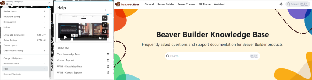
Source: Beaver Builder WordPress Page Builder Plugin
A help center is the interactive portion of a website or app that allows users to search for a long-form article on a particular subject. The long-form help section is sometimes necessary but beware of help articles being used as a band-aid to hide a dysfunctional interface. If we require users to read help articles to have the clarity they need to complete a simple task, we’ve usually failed them.
Level 4: Google or customer support

Source: Google
I put these at the same level because, either way, your user must search for the solution rather than easily find it within the context of the application. If they’re reaching out via a support system (live help, phone, ticketing system, etc.), there are a few things that suffer.
- A strain on company resources
Operating a help system takes staff, and staff costs money. - Coming in hot
The user may already be upset or angry, which could lead to a negative overall product experience. - Mistrust
If the user is googling their question, they are likely landing somewhere off-site and may find a solution to their problem elsewhere. It brings distrust to your brand and doesn’t help your company’s ability to be an authority in the space.
Sometimes we can use methods like conversation mining to pinpoint common questions users have about a product. These are opportunities to improve the UX all the way down at the screen level, potentially eliminating the need for users to ask for help. You’ll be a hero for bringing quantifiable value to the table!
A note on accessibility
Not everyone is capable of or comfortable with reaching out directly if they need help. Some users have physical or cognitive disabilities that prevent them from communicating via specific channels. You have the ability to make it so they don’t have to.