
A guest post by Gil Bouhnick (The Mobile Spoon).
In the past few years, we’ve seen products removing traditional visual elements (such as brand colors, logos, icons, and images) to free up space (and users’ attention) for content.
In such design reality, text is a major design player, and that means words should not only be clear, concise, and useful, but they also need to be visually aesthetic and blend nicely with the product look and feel.
Text is no longer part of the design, it is the design.
And if that’s the case, UX Writers should be more than great writers and need to design their words like artists.
Here’s a list of tips for writing well-designed microcopy that goes beyond the voice and tone, and focuses on the design side.
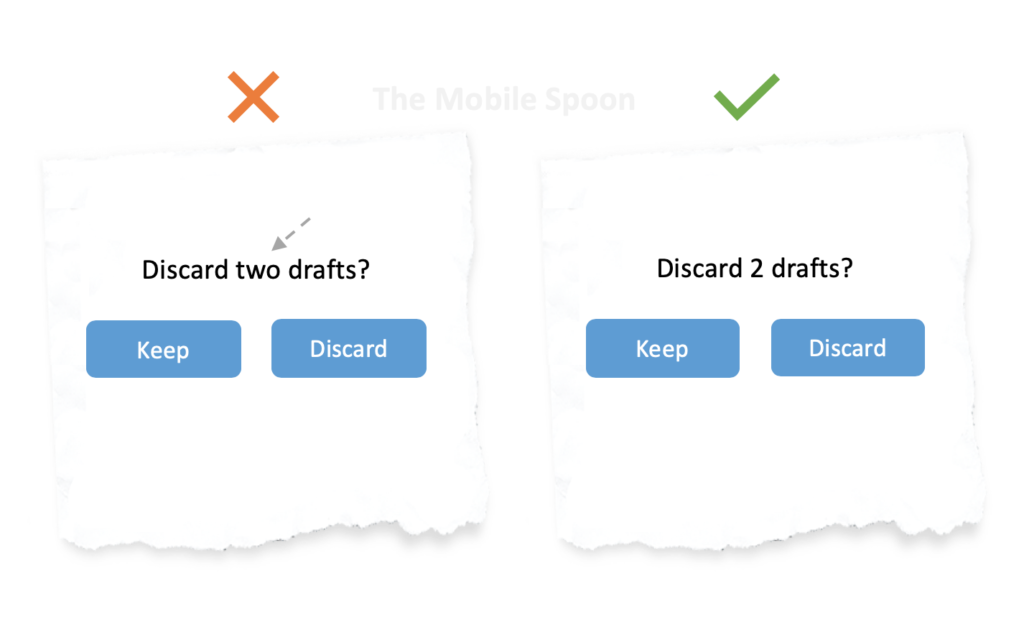
1. Eliminate words for the sake of design
Every UX Writing guide starts with the importance of being concise, but keeping things short is not only important for users to actually read the text and understand it – it’s also important to keep the design clean and reduce clutter.
Fewer words = less clutter
This rule becomes even more relevant in mobile designs due to the limited screen real-estate: once a text block bypasses a certain number of words, users are more likely to ignore it:
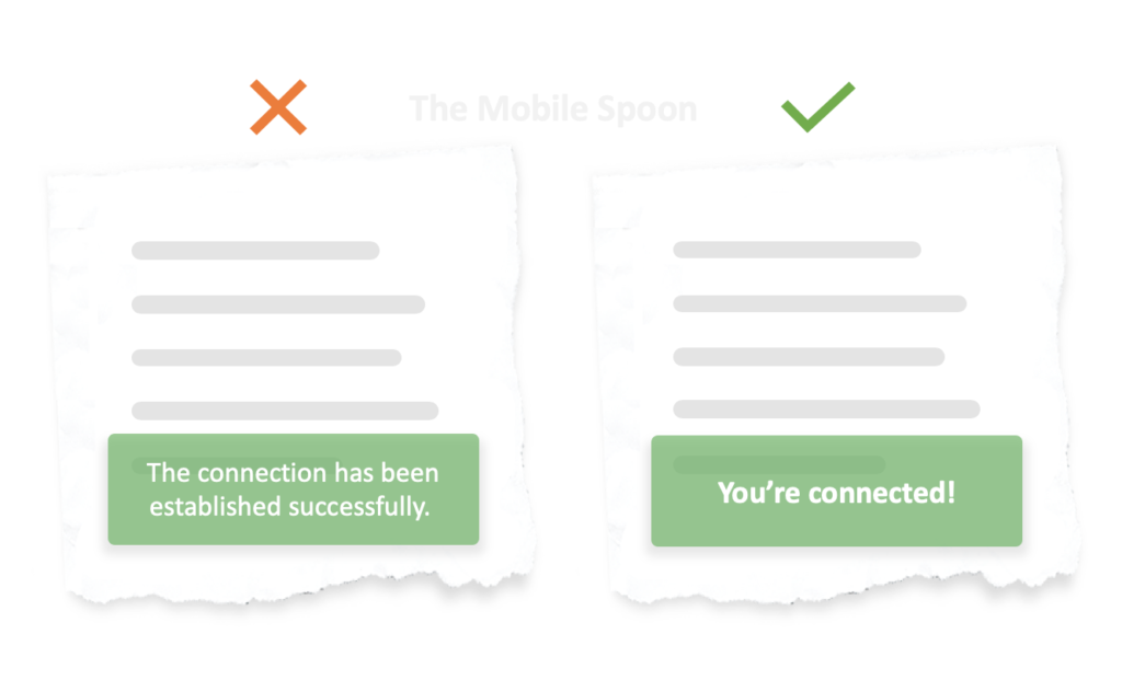
2. Focus on the user
As product creators, we often want to tell our users more about what’s going on inside our beloved product, but with so much context switching and such a short attention span – users don’t have a capacity for long stories.
Focus on what’s matter the most for the users: the bottom line, the action, or the outcome.
Avoid using long technical descriptions, and instead – provide short and accurate status:
3. Use friendly text formatting
When dealing with numbers, dates, duration fields, phone numbers, and unusual data types, it’s important to use friendly formats.
- Whenever numbers are involved – use numerals.
- When including dates in your text – add “today”, “tomorrow”, and “yesterday” whenever relevant.
- Phone numbers are harder to read when presented as one block of digits, use punctuation marks to make the number easier to scan.
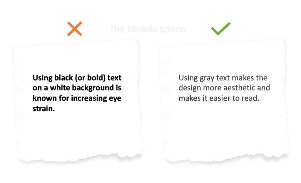
4. Avoid black color, bold fonts, and CAPS
Bold, black or all CAPS text often result in an intimidating design.
To create a relaxing and pleasant user experience it’s better to minimize the use of bold fonts or CAPS.
Black should be replaced with dark gray because pure black (on a white background, or a white text on a black background) increases eye strain.
For more text related rules, check out my 40 rules guide for designing text in mobile apps.
5. Align your microcopy to the design
There are times when design considerations win over copy.
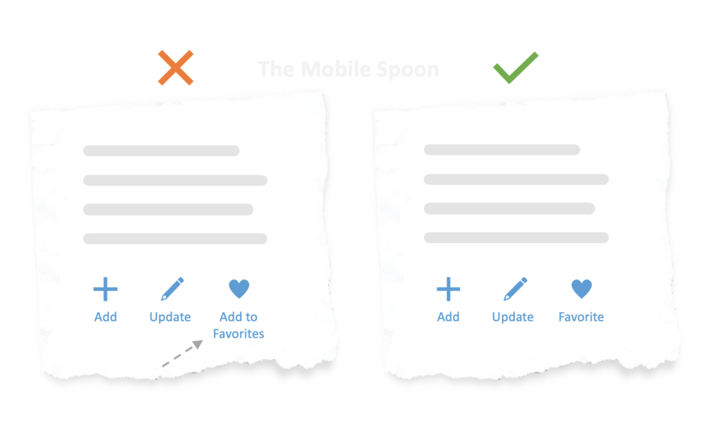
Sure, “add to favorites” might explain the action better, but having 2 lines of text below the button is just unacceptable in this case.
Not only it looks misaligned, but it is also likely to complicate any content that will be placed below these buttons.
When such things happen, the design should win and the microcopy should be changed according to the design constraints.
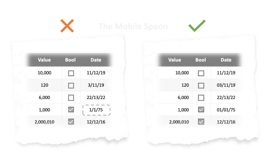
6. Be thoughtful of text alignment
Different use cases require different text alignment.
Center alignment works well for short sections or as a virtual separator. Left alignment is easier to read, therefore better for longer sentences.
When text is placed inside tables – different rules may apply; numbers should be aligned to the right and dates should be aligned to the center while maintaining a fixed number of digits (or characters) to provide a consistent experience.
For example, 1/1/75 should be formatted as 01/01/75 to ensure all dates get the same visual weight and are easily scannable.
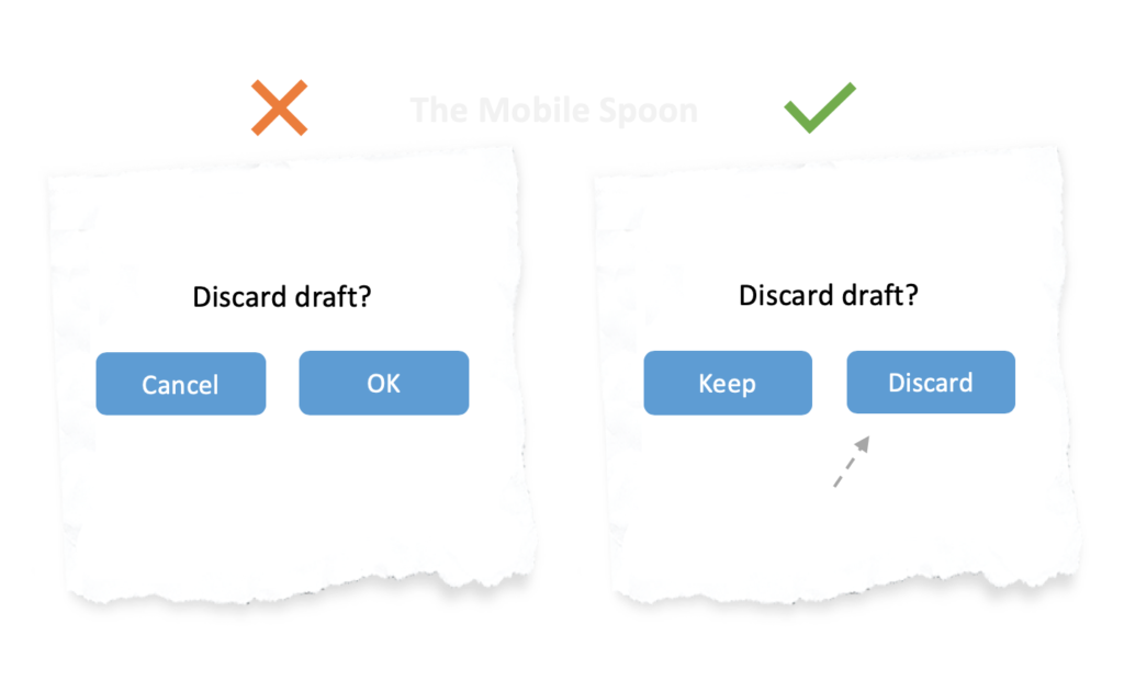
7. Remember that most people don’t read
Users skim through the questions and jump straight to the answers, so make sure the button’s text is clear and includes the action itself, regardless of how clear was the question.
8. Decorate your CTA buttons with “click triggers”
To gain their trust, you’ll need to take a closer look at each step of your funnel, explore any concerns that this step might cause and try to eliminate those concerns using UI design and UX Writing.
Sometimes, a small text decorator in the right place is all the user needs in order to gain trust, clear anxiety, or address a concern.
I call those elements “text decorators” (some call them “click triggers”), and when used wisely, they can encourage your users to act and boost your product’s conversion rates.
To master this technique you need to put yourself in the user’s shoes: what are the things that might cause friction? What concerns they may feel that might prevent them from performing the action you want them to perform, and how can you, as the UX Writer eliminate those concerns and make them feel comfortable to proceed?
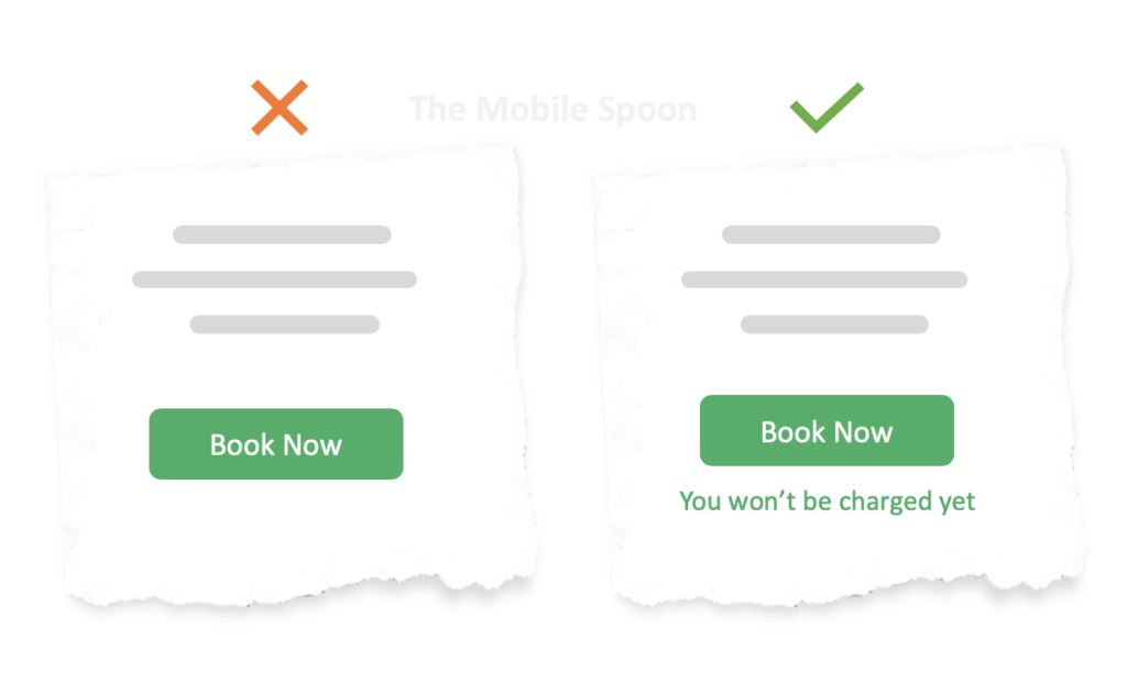
9. Eliminate ambiguity
When we started Missbeez (a marketplace for lifestyle services on-demand), we witnessed a major drop in one of the steps in our funnel. Talking to our users we’ve learned that our “Book Now” button didn’t provide enough clarity as to what’s going to happen next. This situation is known as the “ambiguity effect” in which users are avoiding the unknown and refrain from selection options that are missing information or clarity.
Of course, even the smallest concern or UI hiccup becomes a deal breaker when money is involved.
In our case, many users believed that clicking the “Book Now” button will perform the payment before the appointment actually took place.
A simple UI text decorator was enough to eliminate this concern and improved our conversion rate dramatically:
10. Reduce friction
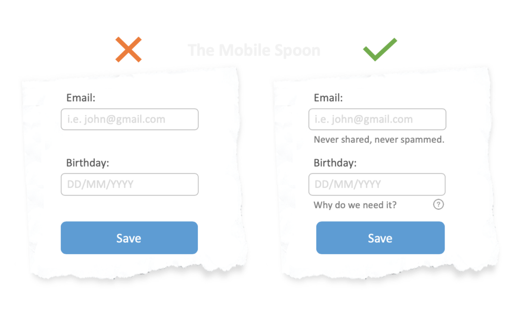
Text decorators are not just for buttons, here’s an example demonstrating how simple text labels can reduce friction and make the users feel safe and secure about providing their personal details:
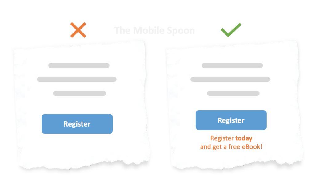
11. Use text to nudge users to act
I recently collected 84 cognitive biases you need to master in order to create better-converting products. It includes plenty of text decorator examples, one of them uses the hyperbolic discounting: a known tendency for people to prefer a smaller-sooner reward over a larger-later reward.
Here’s how a small text decorator can nudge users to act and get a small (yet immediate) payoff:
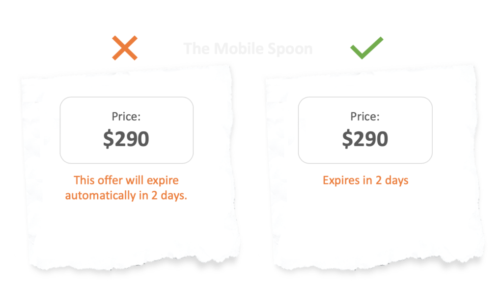
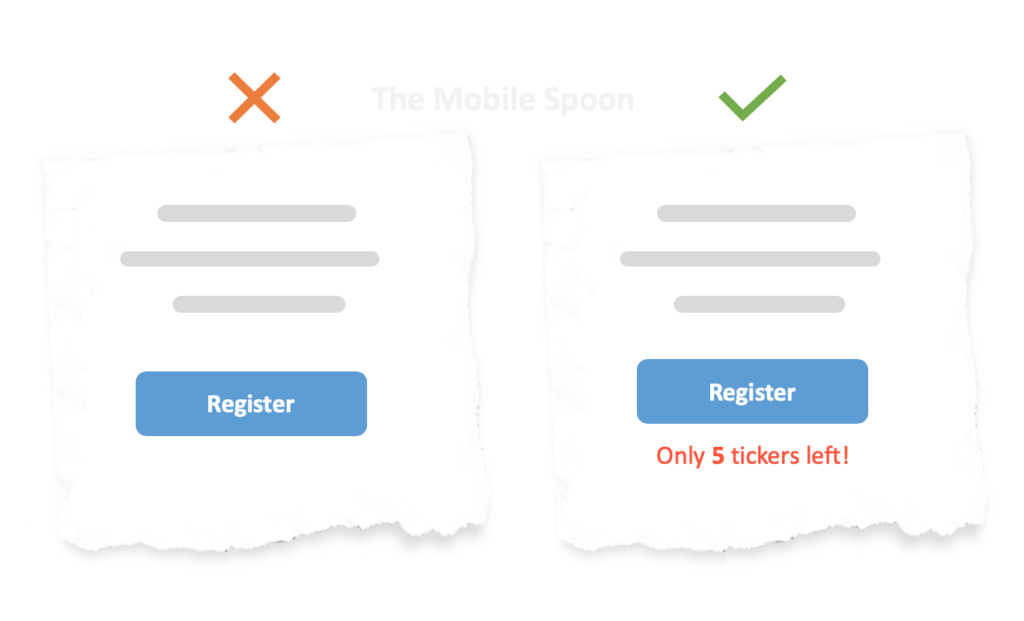
12. Urgency and scarcity
You can’t write a post like this one without mentioning urgency and scarcity.
The best way to see these 2 in action is to visit booking .com, the only product where half of the supply is already taken and the other half is just about to be taken by raging zombies in a matter of seconds…
To be clear – I don’t recommend using urgency and scarcity in such a vulgarian way (although you can’t argue with success), but sometimes, adding a small sense of pressure can improve conversion rates:
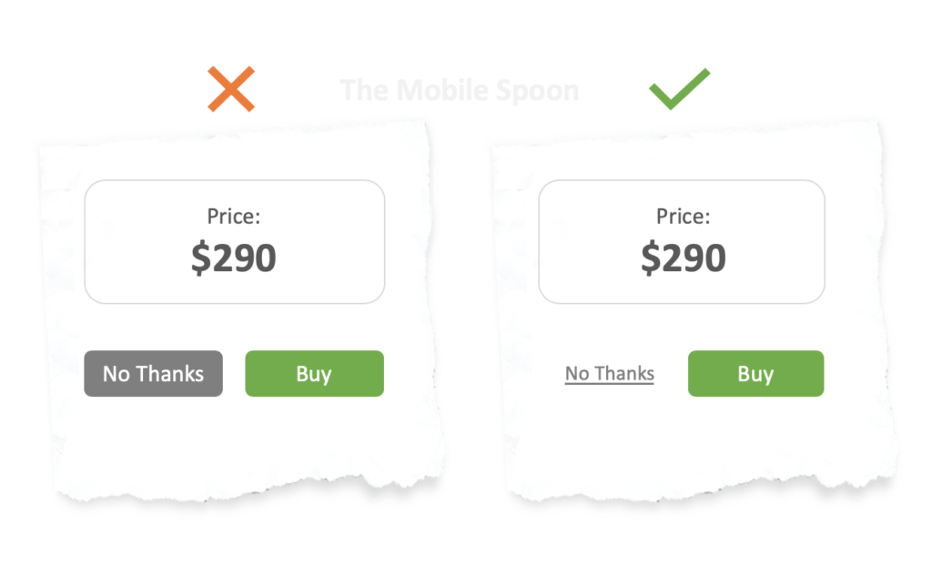
13. Know the limits of words
Designing for maximum conversion often requires more than just text.
When multiple homogeneous objects are presented together, the object that differs from the rest is more likely to be remembered, so emphasize your words with designated designs to make it easier for the users to find the right action.
So there you have it; a few technical tips to help you design better microcopy in your products.
Hopefully you found some of them useful. If so, bookmark this page so your next content will not only be great, but also look great.
About the writer:
Gil Bouhnick is a co-founder and CTO at Missbeez and the owner of The Mobile Spoon, a blog about product management, design, and entrepreneurship.