
Hey everybody! Welcome to the first installment of our new monthly microcopy round-up. We’ve collected our favorite examples and put them together in one convenient article featuring the good, the bad, and the funny.
Thanks to all of our wonderful community members for contributing posts and for their insightful comments. You make the world of UX writing a better place. Now, let’s do this!
The good
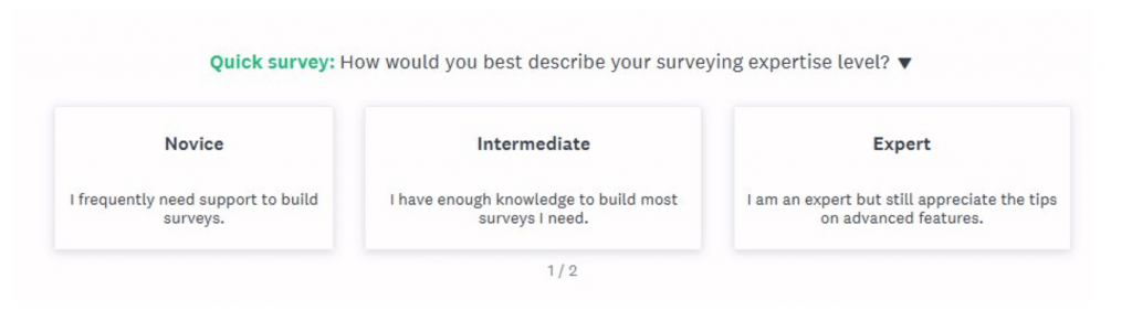
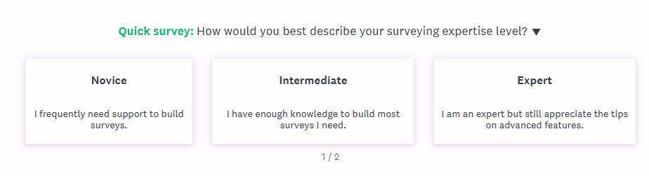
Jack Molisani posted an example from SurveyMonkey with some customization based on experience level. Some took exception with the fact that ‘expert’ doesn’t give the option to not get any tips on features, but in general, we like this design and copy.
Medium is getting cute and clever with their 404 page that has stories about getting lost and losing things.
Ever feel that UX writers should learn to code a bit? If you’re interested, check out Mimo and get a user-friendly experience with great microcopy.

The bad
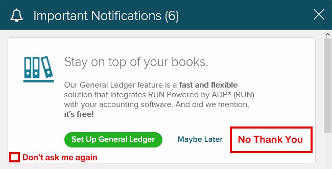
Jack, from the first example, kept it going with a microcopy fail. ADP payroll won’t take ‘no’ for an answer because they won’t give you the option to say ‘no’. Check out Jack’s suggested additions below in red.
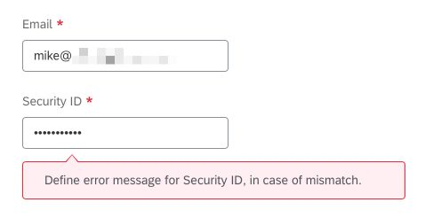
Looks like the robots wrote the copy for this one. Thanks Mike Lightman for posting.
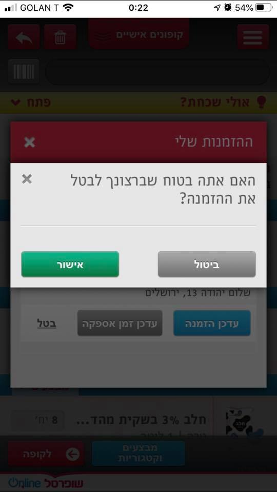
This example posted by Netanya Carmi is in Hebrew, but it’s so bad that it translates perfectly into the universal language of awful design and microcopy. Here goes:
Are you sure you want to cancel the order?
Cancel (gray) | Confirm (green)
It’s keyboard-smashingly bad.
The funny
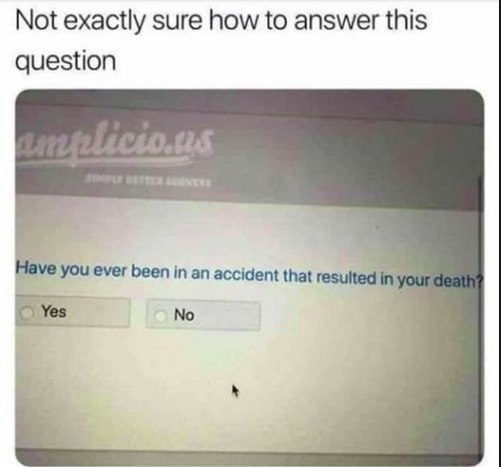
Sourav Biswas shared this rather unsettling question:
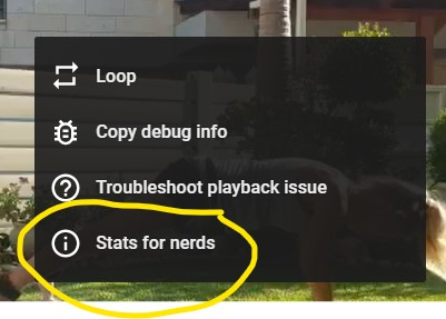
Here’s Google Video being a little cheeky. Thanks Michal Hershtal for posting.
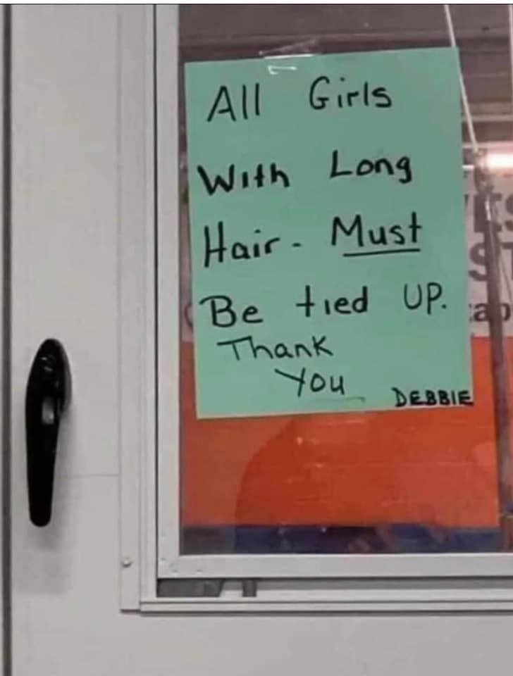
Remember that microcopy can be found anywhere—not just in digital interfaces. Can’t believe they used title case here and a hyphen instead of a dash. (SMH)
Your call
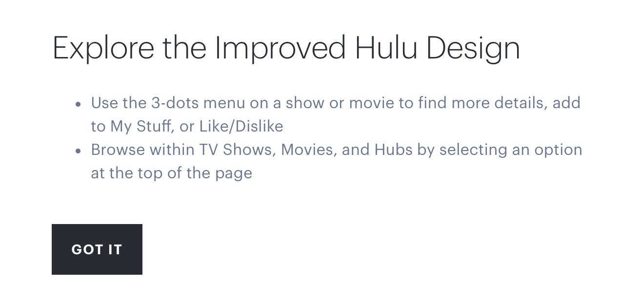
Interesting debate about what to call the overflow menu, aka the 3-dots menu. What’s your take on it?
That’s it
That’s all for now folks—hope you enjoyed it. Check back in September for the next installment. In the meantime, be sure to sign up to our newsletter for weekly microcopy examples, top UX writing articles, and much more