

Imagine that you are teaching your little brother Adam, to ride a bike.
You start with the basics, showing Adam how the bicycle works. Then you get the training wheels out, supporting him every step of the way until he stops wobbling. Finally, you let him play with it — he’ll fall over a few times, but soon enough he’s off on his own like a pro.
Let’s break down these steps with real UX writing examples!
Step 1: The basics
You could also call this step “going through the theoretical framework”, but Adam doesn’t care what you call it, he just wants to get going.
At this stage, the most important thing for you as the product owner is to persuade Adam that your bike is the one he wants to use. And where do you have a great chance to show off your solution?
Above the fold section
Above the fold is the top part of a website — essentially what the users see when they land on it the first time. This section needs a clear headline, a paragraph that explains how your product is going to solve the users’ problems, and a call to action.
This is the moment when Adam spots what he wants at the store and will throw a tantrum if he doesn’t get this particular bike. So how do you make sure your above the fold section is the one that catches Adam’s attention?
One thing is for sure — it is easier said than done, and like most people, you will probably not master the new bike at the first attempt. Try out different things, test them and move forward. Strong visuals are crucial in this part so be sure to talk to the design team and build a strong message.
A great example of a clear and practical above the fold section is the home page of the management tool Monday.com.
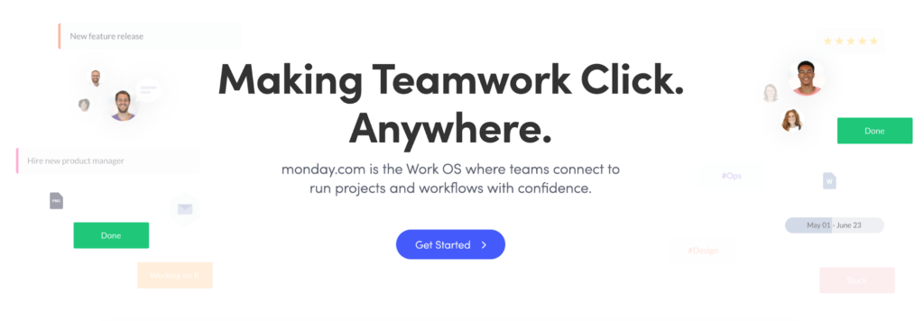
I just want to grab their tool and play around with it, do you agree?
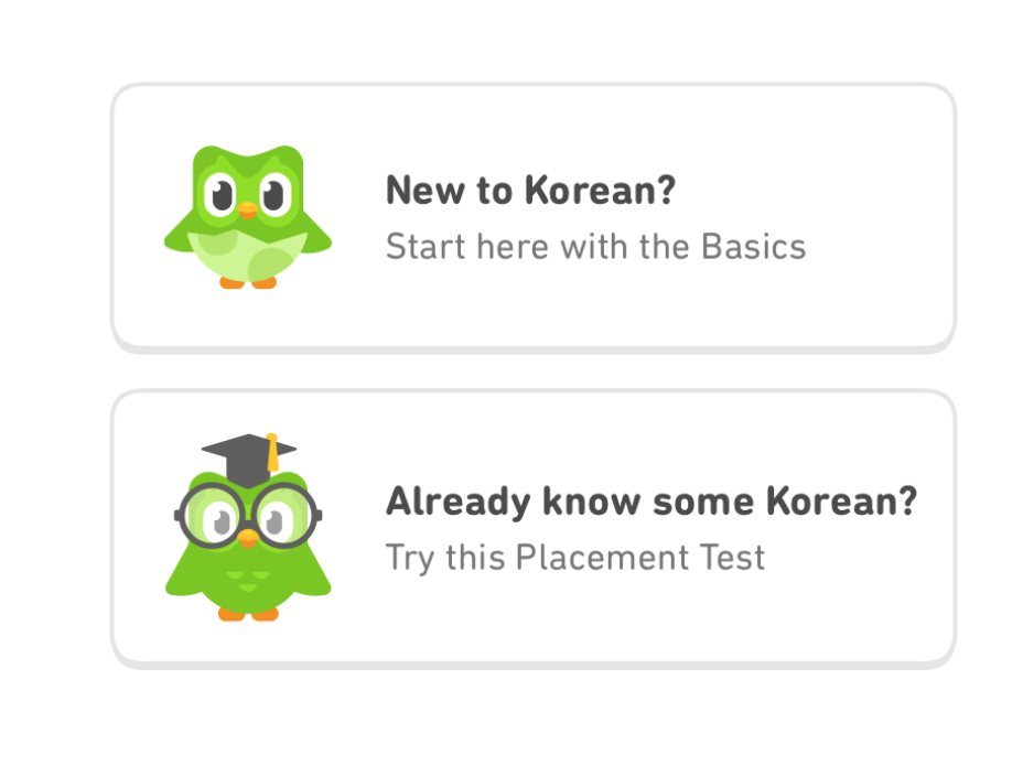
Onboarding experience
Now when your users are in and Adam can’t stop smiling because he has a new bike, we need to explain what he can do with it. In UX writing terms, this is the onboarding experience.
There are numerous ways to do this. Some say you should just let the users play around, others think you should give them as much information as possible. It really depends on the user and the product, so there isn’t a single way to go here.
You’ll find a good explanation and lots of examples of the onboarding experience at material.io/onboarding.
I also recommend following UX designer Samuel Hulick, who shares fantastic insights (and even a book!) on user onboarding.
Step 2: The support phase
We’ve managed to show Adam what he can do with the bike, and he’s now so keen to get going there’s definitely another tantrum coming on. So let’s do it! We’re going to guide our little bro every step of the way from zero to hero.
From complete trial-and-error newbies, your users are going to actually learn how to use the product.
Customer support bot
Tools such as Intercom or Zendesk can help you to create a customer support bot.
The technicalities are easy as you just plug the tool to your website. But the interesting (and challenging) part would be to design a conversation for that bot that will answer all the questions the users have without a live agent.
I’ve never built this kind of bot myself, I just know that creating one would help you to do the next part which is:
Informative FAQ section
Writing the technicalities of a product is easy, creating a useful FAQ (frequently asked questions) section is hard. Adam is on the bike; it’s a bit wobbly but he’s getting there. All of a sudden he stops. He’s spotted the bike bell. “What’s this? Why is it there? How does it work? What is it made of? Where does it come from?” You get the point 🙂
The smart way to go here is to use existing data and pay attention to what it says.
What makes Adam frustrated? When you can explain it to Adam, you have come a long way and should consider making the information available to the rest of the users.
In the real world, you would use the data you’ve collected through your chatbot agent or by holding interviews with your customer support department. The important thing is to use existing data. If you don’t have any, carry out benchmark research — find out what others are doing in your field.
Tooltips
Tooltips are small pieces of text that make sure your users always know what to do. They are often shown automatically when hovering over a question mark or information icon.
As with the FAQ section, the best way to go here is to use existing data. Identify and focus on the bottleneck of your platform — what information do people need to make sure they don’t get stuck?
If you don’t have any existing data, user research is your best buddy. How did Adam’s mates get on with their bikes? What helped them to master the bell?
Create user surveys, hold interviews, build personas, create assumptions that predict how your tooltips will communicate your product better and test those assumptions.
Just don’t try too hard here. Make it short and sweet — there’s no need to overcomplicate things!
Step 3: The pro stage
After scraping his knees a few times, Adam is off on his own. Don’t they just grow up so fast? I know. Now it’s time to let them be.
There are many ways to use a bike. Some turn into power users and ride it every day, while others just use it once in a while. In any case, we want to make sure the bike helps them achieve their goals.
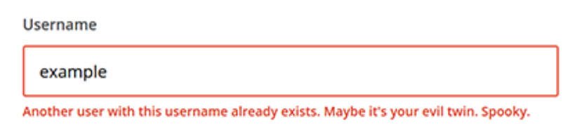
Error messages
If your users are trying to perform an action but fail, the most important thing is to make sure you can solve the issue in the best possible way. When something has gone wrong — imagine Adam getting a puncture for the first time on the way to his friend Mike’s place — he has no idea what happened and what to do about it, but he is very scared that he has done something that ruined the bike forever. This is not a good time to be smart or funny. Even if you know that it’s easy to fix a puncture and the bike will be fine, Adam doesn’t know that. And on top of this, he is upset that he can’t play with Mike.
It’s a good idea to map all the possible errors a user can come across when using your product. This might include a declined card or the wrong password. Be sure to let the user know exactly what the problem is and help them to find a solution.
Even better, try to think of copy that will prevent that error in advance. Do they need to create a password with a particular set of characters? Tell them before they have a chance to enter “1234” in the password field.
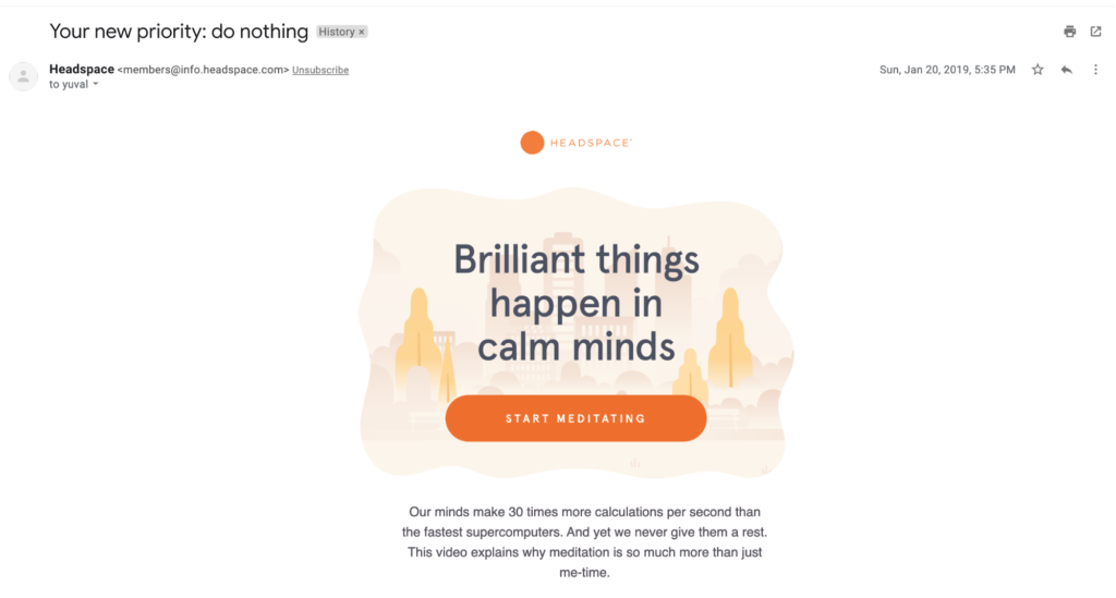
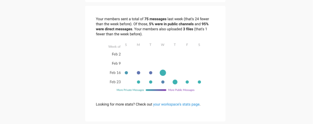
Transactional emails
Many companies do a great job sending emails that inform you how to use their product.
The meditation app Headspace confirms how much time you’ve spent meditating, for example, and offers you new meditation based on your meditation history.
The messaging app Slack lets you know how many people were active in your chat.
They use emails to provide product insights and help you become the champ. Write your transactional emails well and you might just make users for life.
A great idea is to take existing and complex data and present it in a fun and gamified way to encourage people to review the data and aim for better results.
You can read more about transactional emails in this Udemy case study by our student Jim Gallant.
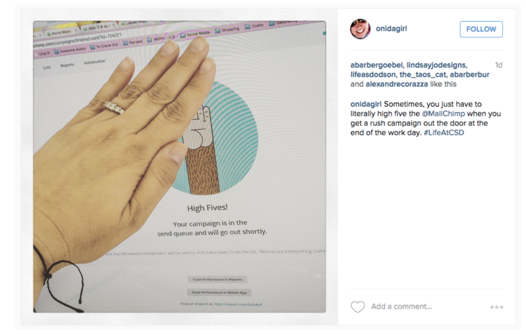
Confirmations
When we try to complete a task, it’s good to know that we’re on the right track.
When your users perform an action in your product, be sure to acknowledge that. The right feedback at the right moment will make Adam a better cyclist. Perhaps it will even encourage him to become a cycling pro? How awesome would that be! If your users upgrade to your premium version, celebrate it with them. High fives, even!
If they send you a message, don’t leave them hanging. Let them know you’ve received the message — if you use automated responses, try to be as specific as possible about when they can expect a response (in the next 24 hours? Within 2 days?). If you tell Adam you will fix his bike “as soon as possible”, he might come back and hassle you about it every five minutes 🙂
Ride out your UX Writing
If you want to make your product’s experience as easy as riding a bike, communicate it as if you are teaching Adam how to ride a bike. At first, there is a lot of groundwork to do, but once you get the hang of it, your users will be hooked.
Just remember, UX writing is about helping your users, not trying to manipulate them to take certain actions. In short, avoid dark patterns and don’t be a jerk!
Now it’s your turn. What can you do today to improve your product or service based on what you’ve read?
For more fun UX writing lessons:
- Join our free UX writing course
- Check out our weekly UX writing newsletter
- Join our UX Writing Facebook discussion group