Table of Contents
Introduction
According to the IBM Carbon Design system, empty states are “moments in an app where there is no data to display to the user.” They are most commonly seen the first time a user interacts with a product or page but can also occur when data has been deleted or is unavailable.
But as we will see, they occur in a variety of instances.
As UX writers, we are heavily involved when it comes to designing these “in-between” moments in digital products. Above anything else, they provide opportunities to improve the user experience and add more value to the business.
In this article, we’ll look at some good examples of empty states and consider what we can learn from them.
Example 1: First use
Typically, an empty state occurs when a user signs up for a product or a service, and there’s nothing to show.
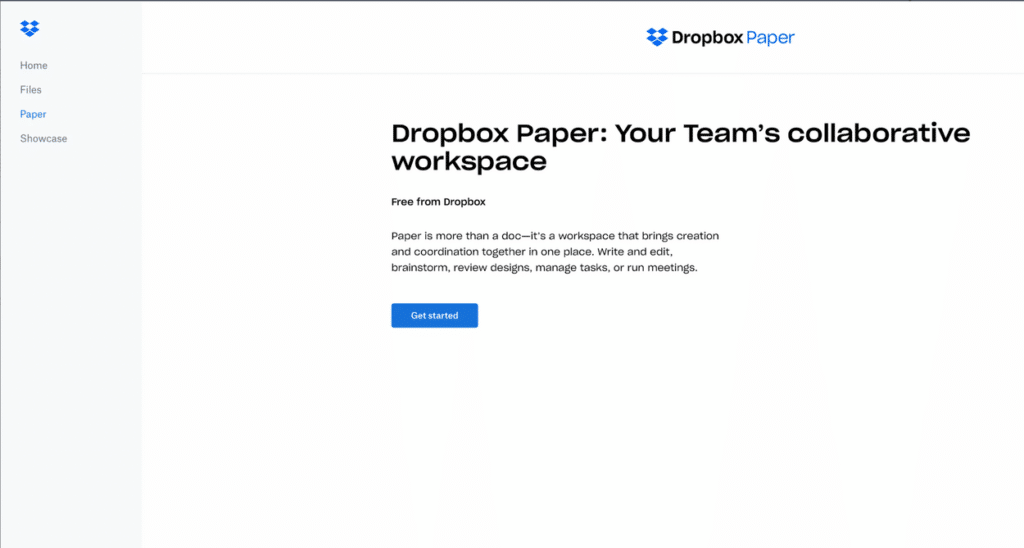
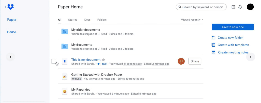
Here is a good example by Dropbox Paper (who are known for their strong UX writing). Dropbox has done a good job condensing the core value of its service into a compelling headline. More than that, they encourage the user to take action. When it comes to empty states, this is the absolute best thing you can do.
Example 2: User cleared
The second use case for empty states is when the user has cleared their inbox or task list and there’s nothing left to show.
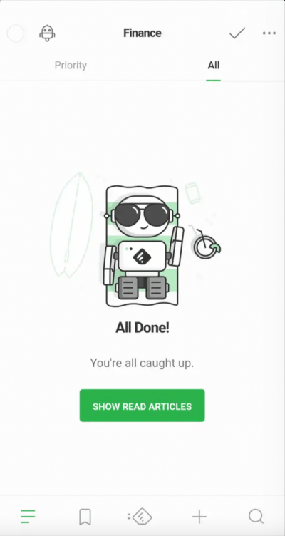
An example can be found in Feedly, an aggregating service that compiles news feeds from a variety of online sources and customizes them to the user’s needs. Their on-brand illustration reassures the user, but more importantly, it encourages them to take action.
Example 3: Errors
The UX writing community has a debate over whether some errors should be treated as empty states. Some errors result in empty states because they are moments when there is no data to display (see example 4).
Depending on what the error is, UX Writers can use it as an opportunity to demonstrate their creativity and get users to take action.
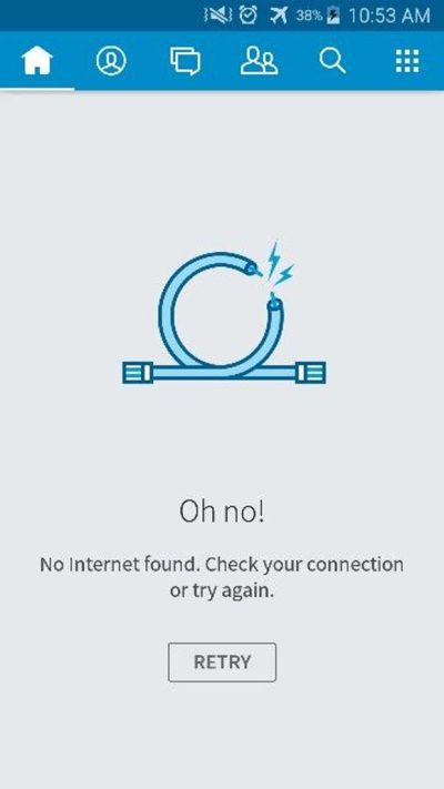
Below is an example of a successful error state in Skype for Android that is both simple and effective. There’s no confusion as to where the problem is. By simply tapping the button, the user can refresh the page easily.
Example 4: No data to show
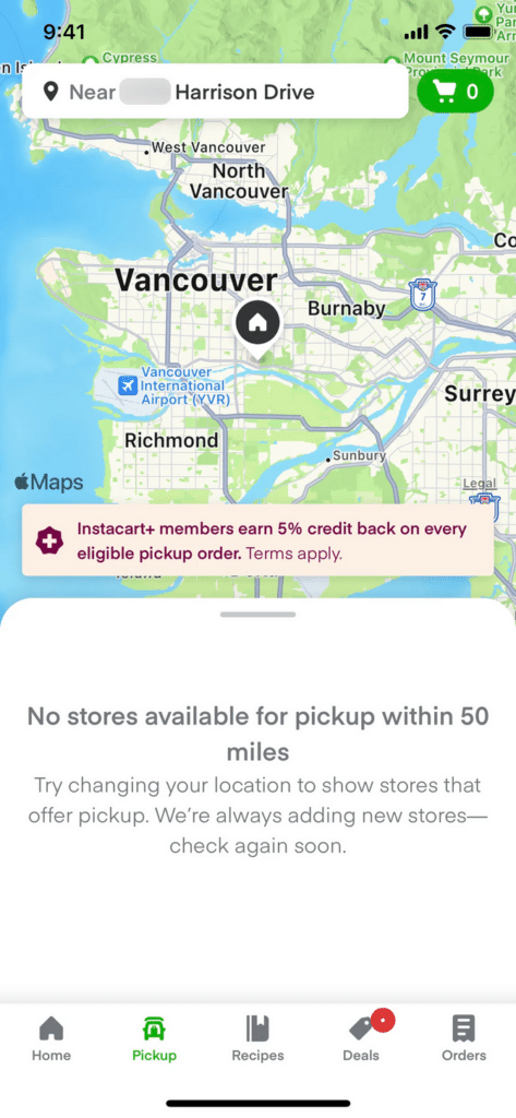
The user can also see an empty state when searching for something, but there are no results. In this scenario, it may be nobody’s fault — there are simply no results to show. Again, this provides an opportunity for UX writers to reassure and guide users to further actions.
Here is an example from an app called Instacart, a grocery delivery service that employs personal shoppers to shop for you and then deliver the groceries to your home.
This is a positive, encouraging, and clear example. Notice what they do in three steps: (1) they tell the user what happened, (2) they suggest what the user can do, and (3) knowing it might not help, they inform the user what they do to solve their problem in the future. Their copy creates a good user experience by bringing value to the user while saving their time.
Example 5: Helpful whenever possible
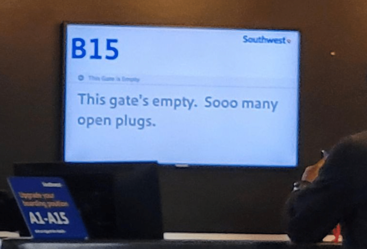
Check out this example of genuine helpfulness at an airport gate. Because there’s no data to show, the screen would normally be empty, perhaps displaying some generic commercial advertisement.
The UX writer, however, saw this empty screen as an opportunity. They empathized with a very common airport struggle — not enough outlets to charge devices before the flight. By using casual, human, and witty language, they speak with the user and create a positive customer experience.
When we empathise well with our users, we improve their experience as customers. In turn, we gain greater customer loyalty. This is what it looks like in action.
Example 6: 404 page
Most UX professionals don’t necessarly view 404 pages as empty states, but there are reasons to approach them as such. After all, the data that was supposed to be displayed isn’t there.
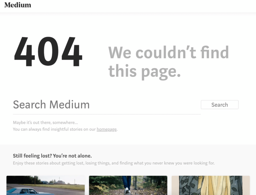
Copy on 404 pages can be (and should be) functional, playful, and goal-oriented. Medium, an online social publishing platform, does a great job here. Most users are familiar with what 404 means, so it is only appropriate that it is displayed prominently on the page along with a clear headline.
Right below the 404, Medium provides a way out by searching for something else (notice the helpful microcopy below the search field). Further down, the thumbnail provides suggestions based on the user’s previous readings if he or she is still lost. The structure and minimalism of this 404 page really appeal to me. Sometimes less is enough.
Example 7: Showing a tutorial at the start
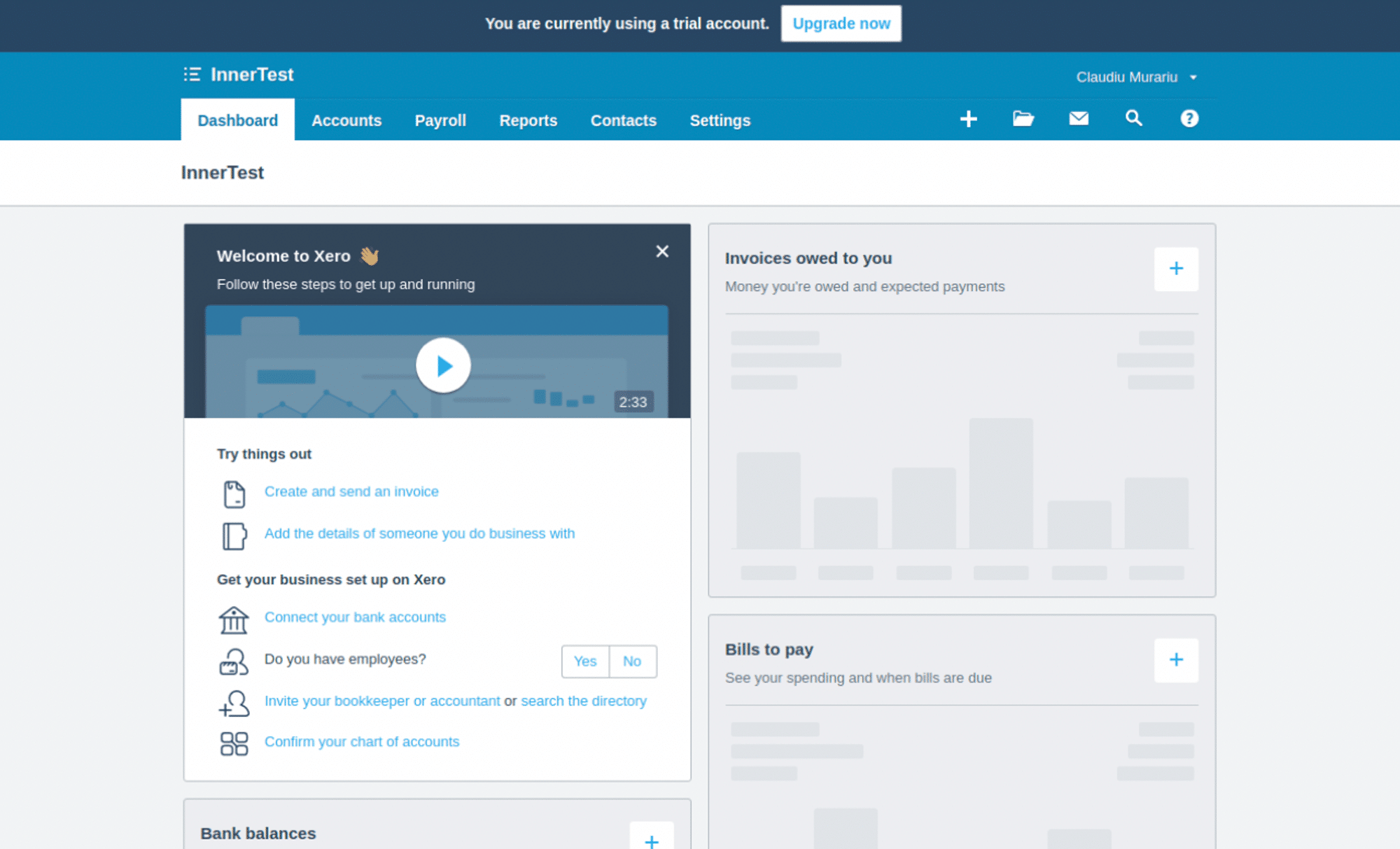
As mentioned, empty states often occur when the user signs up for the product or service for the first time. This example is another approach to the empty state that appears when the user interacts with a product for the first time. It presents an interesting opportunity to show the user around and introduce some of the features of the product.
In this example by Xero, an accounting SaaS platform, the empty state does just that. While the user may be unsure where to click first, the welcome video is prominently displayed at the top of the page, along with a few suggestions.
Example 8: Dashboard filled with default data
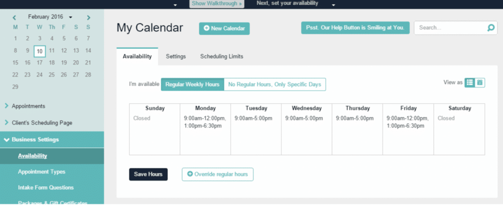
This example doesn’t look like an empty state at first, but in a way, it is.
After signing in for the first time, the user sees a pre-filled dashboard that presents the app’s features. Rather than allowing the user to take action on their own, the app acts preemptively on their behalf.
This is what’s been done in Acuity Scheduling. Your work week gets organized automatically with the software’s schedule, so you immediately get an idea of how the SaaS platform works.
Example 9: Dashboard filled with sample data
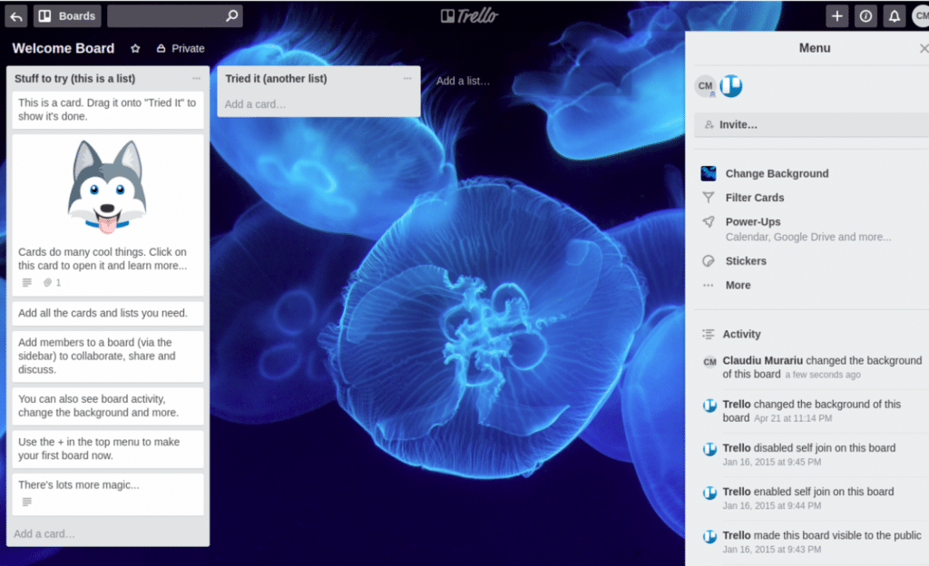
On a similar note, empty states can be used to pre-fill the dashboard with sample data.
In order to help you understand how Trello‘s task management system works, they created a welcome board for you which is pre-filled with cards and past activities. You can delete the whole board and create a new one from scratch.
In any case, you get a good understanding of what the platform works like.
Example 10: Including a gamification element
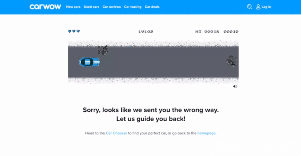
Empty states can provide an opportunity to include a gamification element, such as here in Carwow.
When you go off course on this car-buying comparison site, its 404 page helps you stay on track (no pun intended). Visitors are presented with an 8-bit game-style screen, and you just need to hit the start to play this simple horizontal-scrolling game.
Another good thing about this empty state is that they do a good job of not blaming the user for going off track. They take the blame themselves.
Conclusion
Designing well-thought-out and useful empty-state screens can help drive product engagement, delight users, and reduce churn rate. Empty states also create an opportunity to express your voice brand, prod users to further action, and help them stay on site.
Look out for unobvious situations where empty states occur, such as in examples 8 and 9 and see if you can pre-fill them with helpful data.
Make empty states helpful and delightful whenever possible. In return, you will reduce the chance of losing users to your competitors and improve customer loyalty.
Create empty states that invite further action. Use them to show your brand voice. Keep them useful, helpful, and delightful. Your users will be pleased.

