As UX Writers, we work to communicate the best of our product or service to our users through words. We need it to be effective. Not only creative.
Amos Tversky and Daniel Kahneman worked together to develop the Prospect Theory. All this research gave rise to Behavioral Economics. They were two representative members of this movement. But it was Kahneman and Richard Thaler who got the Nobel Prize for economics being psychologists.
Today I will present to you a few ways for Behavioral Economics to benefit your UX/UI Writing.

How do humans think?
Our brain is busy 24/7 with making complex and simple decisions. For example: currently, you are making the decision to continue to read this article, right? BAM!
Before that, you have decided to click on this article. BAM!
Decision are made all day. So, we receive content all day too. And our brain processes this information activating one of the two decision-making platforms.
→ System of rewards.
This section of the brain is the part that is more receptive to seeing potential gains. We can name two variants: Chance of success and Amount of the benefit. It’s related with the System 1 of the “Thinking, Fast and Slow” book of Kahneman. Because these kind of decisions are made automatically, quickly, emotionally, stereotypically.
→ System of aversion to loss.
Humans have a common behavior. We perceive much more the fear of loss than we do the pleasure of gain. Why? We act from emotion instead of reason at all times of our financial decisions. On the other hand, it’s related with the System 2 of the same book of Kahneman. Because these kind of decisions are calculated slowly and rationally.
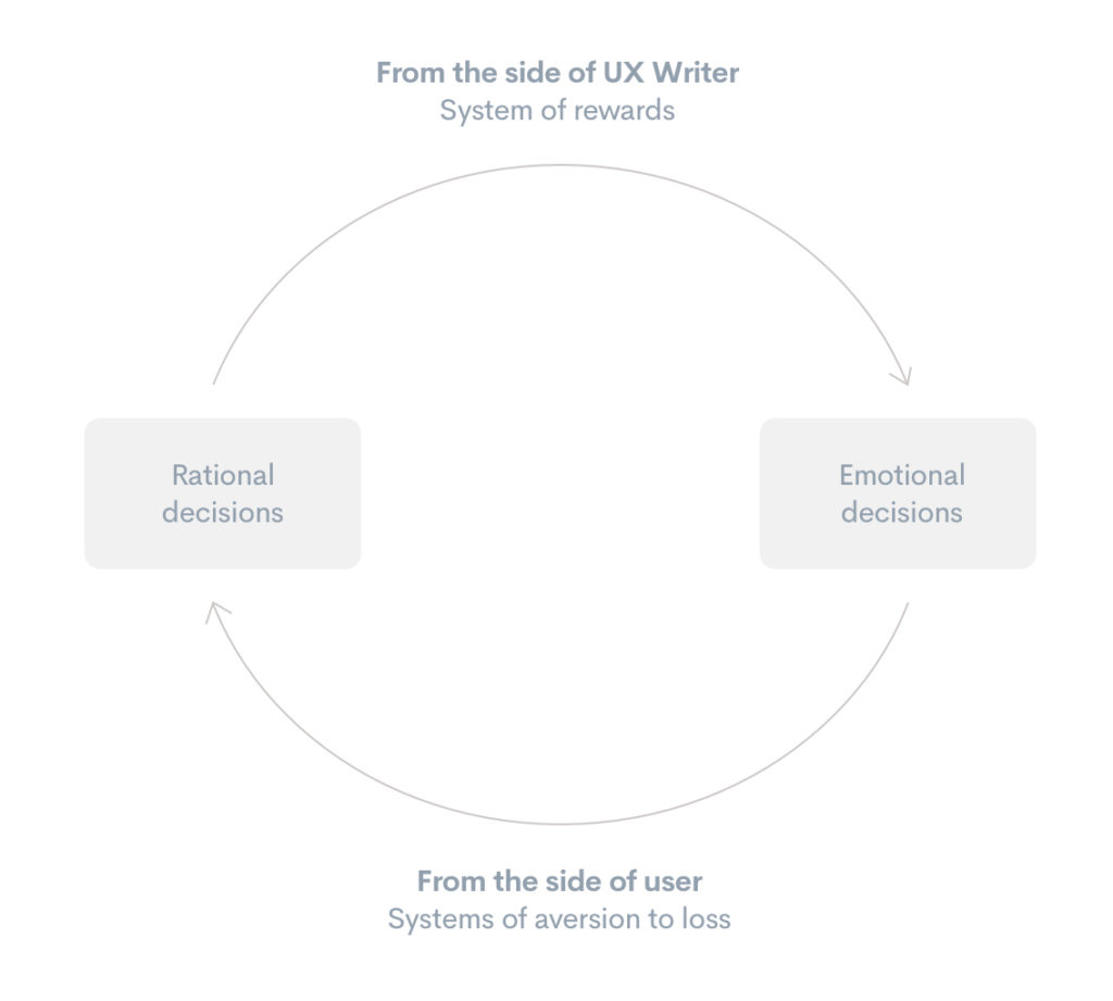
This leads us to the EAST methodology, designed by the BIT (Behavioral Insight Team) to try to establish guidelines that regulate the execution of content adapted to the behavior of humans at the time of making decisions – specifically financial ones. It is based on four pillars to make the content more powerful: easy, attractive, social, timely.
10 Behavioral Economics strategic techniques UX Writers use every day.
As UX Writers, we should never stay in a purely technical work process. That is just a part of our work. Look beyond. Put your head in strategic processes where we can add value by identifying how our users think. The methodologies that I show next aren’t incompatible with each other. Help us to understand better our users and adapt our content based on that.
1 — Profit growth system.
When we try to provide a positive value for the user, we usually tell them all that we have to offer at the beginning. Yet, this way of acting promotes an immediate behavior, that is, a shorter relationship of the user with us. Because once we have given that initial prize to the user, they will go away. And most likely forget us. Perhaps, show that benefit as something progressive can be a better practice to make the relationship with our users more lasting. Adding little by little to the reward that the user gets from us.

2 — Generation of patterns.
Humans are prepared to try to guess what is going to happen. The fact is that if I say: 1, 2, 3, 4… you’ll probably think that what comes next is 5 – quite logically. Or, if I were to say: Monday, Tuesday, Wednesday, Thursday… surely you’ll think that the following is Friday (even more so with the desire we all share to reach Friday, right?). Patterns can help us to build relevant content that impacts users differently.
3 — Intuitive processes vs Intuition.
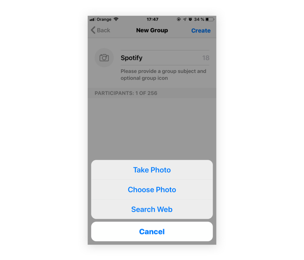
The basis of the user experience is to make processes much more intuitive. Nobody is going to deny that. But intuition is something different to the intuitive process. Intuition is the ability to know, understand or perceive something clearly and immediately. Without the intervention of reason. For example: if I give you four candies to be eaten every half hour, how many hours does it take you to eat the four? __________ Already? Are you sure? The answer is 1 hour and a half, because you eat the first candy right at the moment I give it to you. And the next one at 30 minutes. The intuition is emotional. In short, the processes for the user have to be intuitive. But our way of thinking conceptually doesn’t have to take too much intuition. The intuitive processes are the technical part and the intuition the conceptual part.
4 — NEST approach.
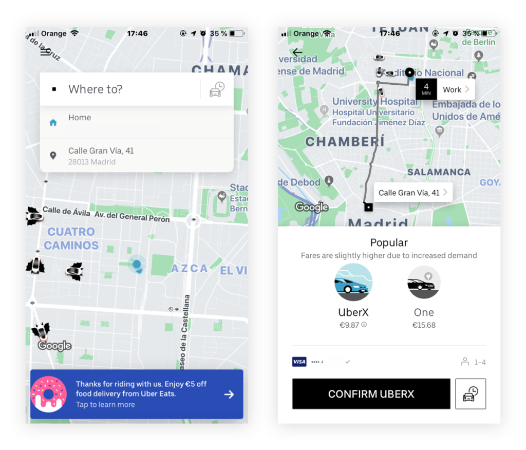
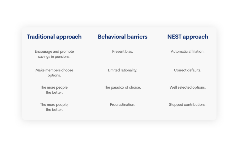
This approach comes from the system of pension plans in the United Kingdom. They discovered something that everyone knows: humans are lazy. And this affects our behavior. So, they thought that the pension plans couldn’t continue to be something passive. Because they couldn’t wait for people to join the pension plan of their own accord. So, they did it in reverse. The companies would dedicate a part of the payroll of each worker to a pension plan for that worker. And the reasoning is simple. Since we are lazy, if we have to do it ourselves, we do not do it. And if we have to take it away (as in the United Kingdom) we will not take it off either.
5 — Mirror neurons.
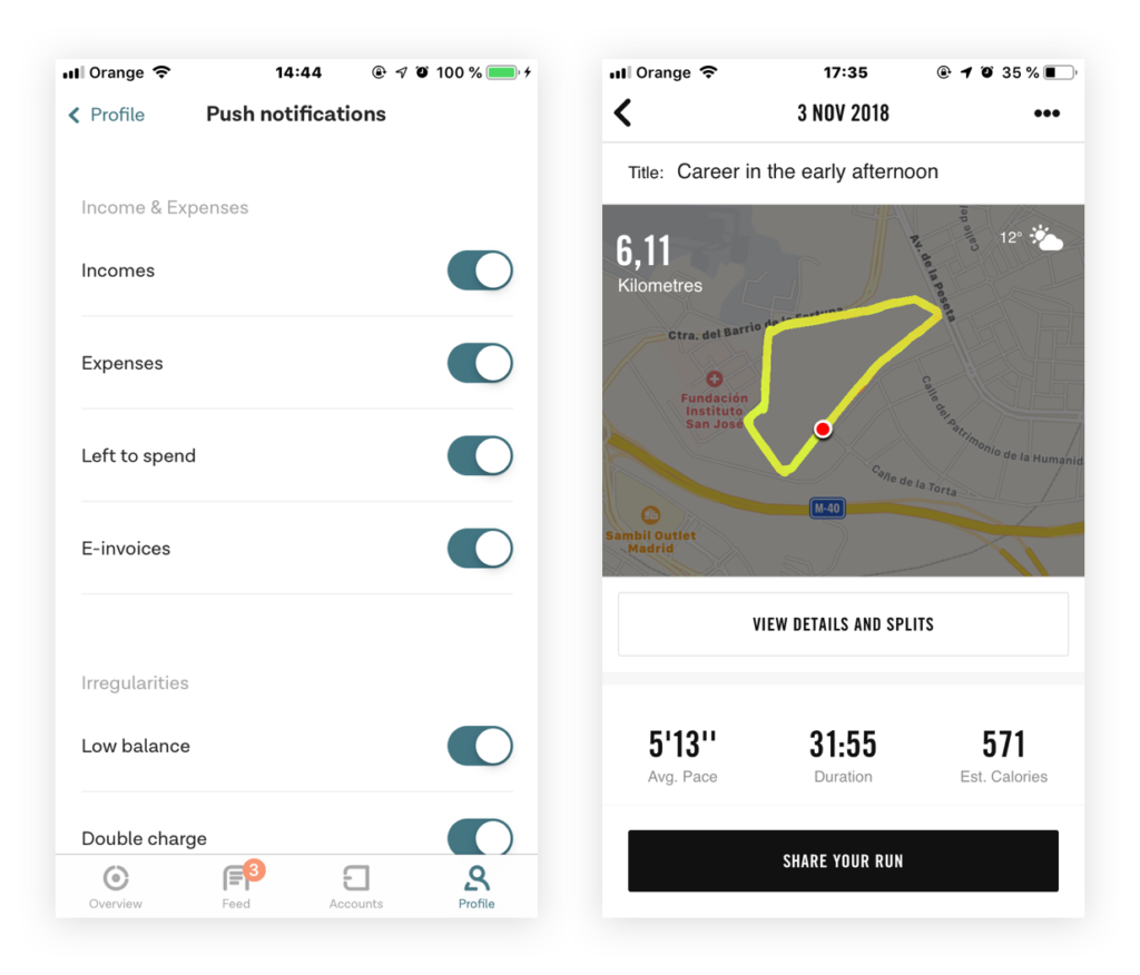
One way of motivating many users to do something is to tell them how many other users have already done it. And if we have the option of knowing the typology of these users, even better. For example: users who live in their region, who are the same age as them, or who have bought in the same establishment as them, etc.

6 — The other side of the coin.
When we are facing a project, we take more time than usual to analyze the needs that it requires. For example, there are two ways we can communicate a monthly expense report via email:
- Immediate. We tell the user what has been spent in that month and that’s it. It will always be a negative amount. So imagine something like this: Your spending for the month of August was €786.54.
- Thought and rethought. We can tell the user what he has added (if it is the case) in positive to his total savings. We know the payroll you have because we are giving you an expense report, which means that we have your financial information. And if we know the payroll, we know if the expense report is greater or less than your income. So we could say something like: You have added €312 more to your account in August.
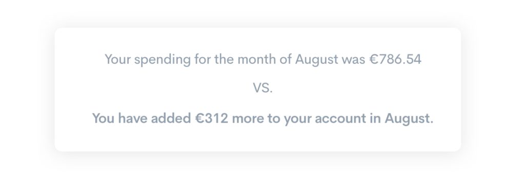
In short, they are two ways of saying the same thing. But one’s cooler than the other, no?
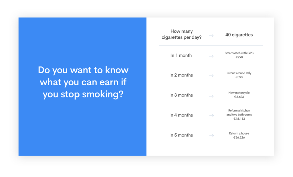
7 — Rewards translation.
Perception is a very sudden behavior of humans. Sometimes it happens that we read something which we need to read again to understand the value it gives us. Yet, the response of our users will be better if we compare that value with another benefit for them.


8 — Hick’s law.
This law is important for UX Writers because it specifies a very clear question. The decision-making time of a user, increases or decreases depending on the options they have to choose from. If there are many options, it will take longer to make the decision. If there are fewer options, it will take less time to make the decision. We have to learn to synthesize more and to link content.
Also, a very important consequence is the opportunity cost or a feeling of regret. Choosing a choice of many options is frustrating for the user because they don’t know if the unchosen options are better. “Might they have been better than the one I’ve chosen?”, “Have I made a mistake?” etc.
9 — Effect of Serial Position.
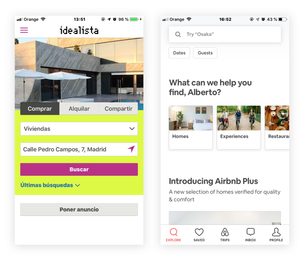
This has to do with series of words or contents. Users can better remember the words at the beginning or end of a list. Because these words are collected in the episodic memory in the short and long term.
→ Primacy effect (first elements of the list). We remember more easily the first elements of the list. The opportunity to review them increases the probability that they will be transferred to long-term memory.
→ Element of the medium (middle elements of the list). The elements of the middle part of the list are the most difficult to remember. They were presented too long ago to be remembered by our short-term memory. And since there are many elements before and after them, it will be difficult for them to be in the long-term memory.
→ Recent effect (last list elements). We remember more easy the elements near the end of the list because they still remain in the short-term memory.

10 — Measurements.
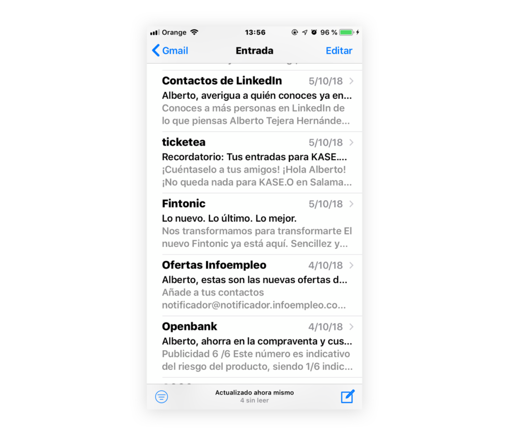
And finally, this technical trick may seem very obvious, but it isn’t always put into practice. When we write emails and we need an email subject, try to test it before sending it. Why? to check if it is completely in mobile format — that is, if our message is not cut in half. This trick is very simple which also serves for headlines, notifications, buttons, etc.
And with this simple exercise we will discover frictions that can be improved.
In any case, the most important thing to keep in mind is that the way to engage a user is to create value. And how do you create value with your content? These three guidelines can be very useful:
- Solve problems of users.
- Satisfy needs of users.
- Discover important tasks before it is a problem or a need for the users.
I hope I have helped you with these tips on how to adapt Behavioral Economics to UX Writing in everyday day-to-day practices. Now, we have to continue making our users want to read, reread and be part of what we have written for them.
Rock on friends!
About The Autor
My name is Alberto. I have a background in a creative agency, working for important brands in sectors like financial, automotive, fast food… among others. Currently, I’m an UX/UI Writer — Architext at Fintonic. The most important fintech in Spain. We help all private users to have better control of their finances, and to boost their money.


