

This content about the cost of UX Writing was originally published in Polish on the product management blog – ProductVision.pl.
Content design/UX writing for some people may look like unnecessary work. From the layman’s perspective, content designers may look like they are just doing excessive text editing. Pampering their words. Clinging to unnecessary details. And we know the Silicon Valley motto that “done is better than perfect,” right? On numerous teams, this leads to saying – we already have some text, let’s go to production. Sound familiar? ?
The problem with determining the value of content design
Content design is a way to find out about the language and mental model of your users, and turning that knowledge into words that strengthen the product user experience.
But content design is not free. When you have UX writers aboard (I will use the term interchangeably with “content designer”), you have to pay them. Whether you have a single UX writer or an entire team, it’s a noticeable cost to the organization. In addition to the added salaries, content design costs time. And it’s not only the time of writers. It’s the time of the project team, the development team, the testers, the product managers. The cost may be, for example, the time required for extra tests, delays, or a prolonged manufacturing process.
Thanks to UX writers, though, more and more products communicate better. The number of good examples of streamlined communication is growing. You can find blog posts on how to create “microcopy” (text in the user interface) and even galleries of beautiful microcopy examples.
The problem with such collections, especially when you’re concerned with costs, is that the collection curators often subjectively choose examples that, taken out of the context, offer no information about how they work for the product or whether they affect user experience or revenue. I have yet to meet a microcopy collection that describes how each example affects conversion or retention. We also learn nothing about the content designer decisions behind the samples. And they don’t mention money.
So how should you know if well-crafted communication makes sense (and money)? That is what I hope to show you here.
The examples I collect in this article highlight the value rising directly from words. You can find more examples on the Internet where careful work on words, and especially on words in the UI, have brought spectacular financial results. For one, see Jared Spool’s description of how changing the Register button to Continue, together with a slight change in the purchase process, resulted in a 45% sales increase. This change of copy and design resulted in an extra $300,000,000 (300 million!) within the first 12 months after the changes had been introduced. The cost of such modifications isn’t always low, because it requires the entire product team to work. I omit cases where complete forms, pages, and interactions, together with microcopy, were redesigned. I want to emphasize what happens when you fiddle only with the text.
One phrasal verb
When passengers were taking their seats on Flight 6901 in Beijing 25 years ago, they had no idea they were stepping into history (as described in Wikipedia). When the machine started to descend to the destination airport at Ürümqi-Diwopu, the automatic pilot stopped working. The captain of the plane tried to correct the excessive rate of descent manually. He focused on the cockpit instruments and instructions displayed on the on-board computer. Unfortunately, at the moment the pull up message appeared, the pilot didn’t react and the plane crashed. Of the 102 people on board, 12 died. An analysis of the black box recording indicated that the pilot, instead of making the suggested maneuver, asked the first officer what “pull up” means.

Photo: Wikipedia. Sister-ship to the accident aircraft
Pull up is a phrasal verb. Let’s assume phrasal verbs can be liberally classified as idioms. Something that cannot be easily translated or explained. Something that is mostly clear to native speakers only. Non-native speakers of English usually have problems with this type of construction.
A little consideration of words could have prevented this tragedy. A flight crew with poor command of English could have reacted differently. If only the computer had displayed go up! Or if the design team had done some testing with various groups of people. After all, American airplanes (like the crashed McDonnell-Douglas) are not piloted only by Americans. Unfortunately, two seemingly insignificant words contributed to the loss of human lives.
One apostrophe
Cardiac arrest. The blood stops circulating. The brain gets less oxygen. There’s panic all around. Someone calls for an ambulance. Every second counts. The emergency dispatcher asks about the situation, you answer, and the clock keeps ticking. The dispatcher’s question matters. The Belmont paramedic team found that by saying the same sentence, only in two different ways, you could save or lose 9 seconds throughout the conversation. They asked:
“Tell me what has happened.”
or
“Tell me what’s happened.”
It turns out that Tell me what’s happened makes people focus directly on what happened just before they grabbed the telephone. The conversation is shorter and more informative. When contractions are expanded, callers tend to tell stories, often about the entire day, full of unnecessary details.
It’s amazing what grammar can do! Do you remember your English classes? We were told not to use contractions in writing and official conversations. Because it’s colloquial, the “low register.” Not suitable for the communication of educated people. Life proves teachers wrong. If someone didn’t bother to pay attention to the way you speak, it would be harder to save time and rescue lives.
One comma
Five million dollars. That’s the cost of the settlement Oakhurst Dairy company had to make with the suppliers of their products. The reason? A missing comma in the contract describing the obligations of suppliers. A very special missing comma – the Oxford comma (also known as the serial comma).
Among native speakers on the North American continent, there is still an ardent discussion about whether this is a stylistic or semantic tool. Oakhurst Dairy learned painfully that a serial comma changes the meaning of the sentence. This is the sensitive part (my emphasis):
The canning, processing, preserving, freezing, drying, marketing, storing, packaging for shipment or distribution of:
– Agricultural produce;
– Meat and fish products; and
– Perishable foods.
For the company’s drivers, “packaging for shipment or distribution” meant a single operation, not two different tasks. Drivers transport products, they don’t take care of packaging. Therefore, they demanded payment for an extra job. The case went to court, which recognized the suppliers’ point and thus showed that the comma affects the meaning of the sentence.
They could have avoided this legal trouble. Probably the Oakhurst Dairy writers and proofers assumed commas like that don’t change the meaning. No one assessed the impact of punctuation in a complex legal text.
Today some product designers in their style guides recommend the Oxford comma (including BuzzFeed, Shopify, US government agency 18f). If you deliver your product in English, using the Oxford comma consistently is worth the effort. In my experience, this type of comma positively affects the way non-English speakers comprehend your text.
Two personal pronouns
The Unbounce company tested how their call to action (CTA) influences the number of started free trials. One of the buttons said
Start my free 30 day trial
and the other said
Start your 30 day trial.
How did they perform? The company saw a 90% increase in the click-through rate with the Start my free 30 day trial copy.

Illustration: unbounce.com
They did a similar test for another product. The buttons said:
Create my account
And
Create your account.
The Create my account version performed 24.9% better.
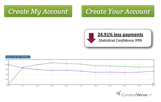
Illustration: unbounce.com
The battle was between “my” and “your” — two simple pronouns. It may seem absurd to think that such a tiny change could improve customer engagement so dramatically. But every button click takes potential customers a step further in the conversion funnel and closer to sales results.
Unfortunately, Unbounce did not say who the tested people were (for example, how well they spoke English). Without this data, it’s difficult to define the precise reasons why the pronouns matter so much. But we can assume that the call to action containing the word “my” in some way strengthens the sense of ownership in users. Maybe they think “this is for me” or “it’s already mine.” One thing we can say is that devoting attention to every single word and testing even trivial changes can be of considerable business importance.
One sentence
A payment form. Zero optional fields. Customers provided information such as a credit card number, CVV, name, and address. The address field was labeled Billing address. So people entered their data, the data looked good, but the payment didn’t go through. Result: 5-10% of transactions weren’t finalized. Customers spent their money on competing sites instead.
Fortunately, a patch worked. A very simple thing. One sentence added:
Be sure to enter the billing address associated with your credit card
Boom! The problems disappeared. The company started to earn more money in an instant. A single explanatory line was enough to communicate clearly and overcome cognitive bias. The seller assumed people would understand what kind of address was required. But they didn’t. People saw the “address” field and they entered their current address instead of the one associated with their credit card. No wonder payments didn’t go through.
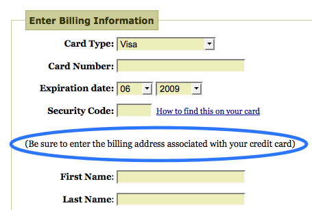
Illustration: Blog bokardo.com
One word
Expedia had a similar problem. An analysis of their purchase process data showed that there was some inconsistency between the number of completed payment forms and their actual profit. People entered the payment details, their name, credit card numbers, etc. Most likely they were going to pay. They took the time to fill in the form correctly. However, no transaction followed.
The form had a field labeled Company. It was placed just under the name and surname of the card holder. It turned out that a high number of customers entered the name of their bank there. Consequently, when they proceeded to the field with the address, they also entered the bank’s data, when they were actually expected to type in the name of their company and their home address. However, the context of the payment fooled people. As a result, the address didn’t pass validation because it wasn’t the address of the cardholder. Communication failed.
So Expedia removed the Company field. Effect? An additional $12 million in revenue per year! Not to mention the diminished cost of supporting customers who stopped asking for help after the payment failed.
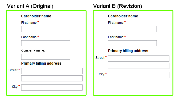
Illustration: Digital marketing blog
So, does it matter how we choose words?
Every day, a lot of our daily actions boil down to how we weigh our words. In conversation with our partners, some words hurt and some words soothe. Some words help and some words only make things worse. It’s the same at work, when you talk to your managers or subordinates (for example, by giving feedback). And when we talk to children, proper choice of language is essential (as we are reminded every time children pick up inappropriate phrases and use them in the least appropriate situations).
But the importance of weighing our words tends to be less obvious when we turn to digital communications. Partly, this is for historical reasons. The first texts in computer interfaces were created by coders who did not necessarily think in terms of psycholinguistics when they were squeezing words into their interfaces. And with all the usual design adventures and day-to-day implementation struggles to distract us , it has always been hard to maintain focus on using the precise language to express the product vision.
Perhaps more than anything else, the problem with screen text is that we write how we were taught to write. People tend to automatically switch to an unnatural writing voice when they don’t see their listeners, which is exactly what our schools taught us to do. We were told to use a completely different sort of language, a different voice, when we wrote our dissertations, essays, letters, and so on, and we were told to never use colloquial language. So we write as if we forget that there are people listening and reading on the other side of the cable.
What does this mean for our products?
The user interface isn’t just a sequence of neatly arranged objects. It’s communication with people. The same rules apply here as in a face-to-face conversation. The fact that we do not see the people we are aiming our message at forces us to focus much more on what we say and how we say it. In the digital world, we cannot use gesture or facial expressions. To a limited extent, we can only operate with the tone of voice. Words, punctuation, and grammar are as crucial as colors, shapes, and page layout.
It wasn’t the machine that contributed to the death of 12 people in China. It was a poorly selected verb.
It isn’t space technology that dispatches ambulances faster in Australia. It’s grammar.
It isn’t colors or button size that converts people to Unbounce. It’s their choice of words.
The examples selected for this article show that tiny things often ignored and downplayed during the design process can have a colossal impact. In these specific cases, dismissing careful word choice with “it’s just copy” essentially comes down to “it’s only 12 million dollars” or “it’s only 12 people.”
Meaning (of words) has (business) meaning. This is why you need to design content. This is why you should take the time to study how your words work in the world. You need to check whether the message is readable. You need to make sure the language you use is similar to that used by your users. Sometimes it requires going through UX interviews or examining records of customer support calls. Sometimes it means conducting additional A/B testing. And sometimes it requires a few other magic tricks that content designers have up their sleeves.
Please note that the examples provided here also show that changing microcopy is one of the fastest ways to improve a site, especially in SaaS products, where text changes on the platform can be done right away. A redesign can take a lot of time – it requires wireframes, acceptance tests, and implementation. The addition or deletion of a text is a much smaller operation and at times returns unexpectedly good results.
Think what can happen when content people work systemically. For example, when your system gains extra strength from content strategy. Content design is part of the content strategy. In the discussed context, it is the most important, because it is visible and experienced directly by users. If you manage to integrate content design into your product manufacturing process, then who knows? Maybe you’ll also end up with an extra 300 million dollars in revenue.
Further reading
35 Examples of Great UX Writing To Spark Inspiration